A friend of mine who works in mining sent me this super interesting LINK to a series of infographics developed by a company out of Vancouver that you may or may not have heard of by now. Visual Capitalist only recently flew onto my radar, though they've been around since 2011. Their aim is to guide investors in ways that weren't really feasible before the information age, using "both data visualization and infographics to showcase [their] original research on commodities and equities". The bonus is that some of the work they produce (like this gold series) is easily digestible for "regular" people (maybe "curious" would be a better word) who just want to learn a thing or two.
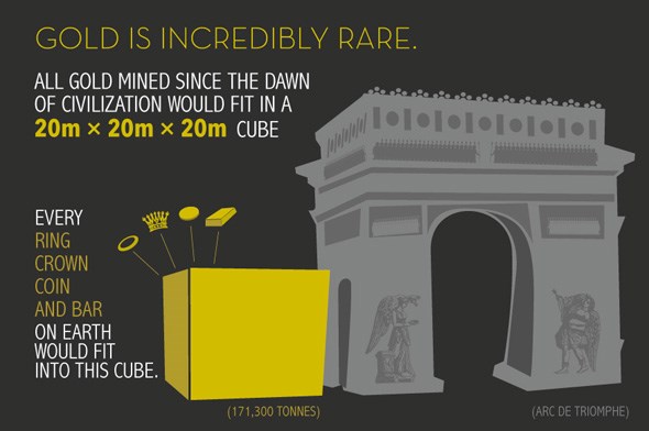
There are five super deep infographics that make up this particular series, and the most interesting thing I picked up from it was actually this second point they made on the first page...
Take a few minutes today and check out the entire thing HERE and learn a thing or two!


