The Vancouver Canucks are bringing back one of the most popular jerseys in their 50-year history next season, reviving the skate logo that was worn during the 1994 playoff run. Now the Kalamazoo Wings, the ECHL affiliate for the Canucks and Utica Comets, are getting in on the retro skate logo fun.
The Canucks’ skate logo jersey won a fan vote a year ago to be the team’s retro jersey for the upcoming season. When the jersey itself was revealed with the team’s other jersey designs for the upcoming 50th-anniversary season, it was clearly the best one.
While the Canucks’ new home and away jerseys minus the “VANCOUVER” wordmark across the top are fine, the “vintage” third jersey looks a little odd, primarily because of the lack of white stripes to go with the broad green stripes on the arms. The skate logo jersey, however, is clean and crisp. They could have tried to update it or modernize it, but instead it looks like it was ripped directly off Trevor Linden’s back after he skated off the ice in the ‘94 playoffs.
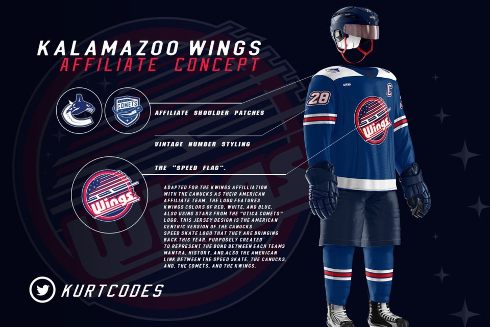
The K-Wings held a fan-vote of their own for a new alternate jersey with their third annual fan-designed jersey contest. The winning jersey from designer Kurt Gorecki takes inspiration from the Canucks’ skate logo to create a truly fantastic jersey.

Just look at it. That is gorgeous.
The jersey replaces “CANUCKS” with “WINGS” as the skate blade of the logo and turns the stripes of the skate boot into the stripes of the American flag by adding the stars from the Utica Comets logo into the background. It’s a tremendously clever bit of design work from Gorecky, who goes by @KurtCodes on Twitter.
“I wanted to incorporate my favorite Vancouver logo and thought ‘how could I make this different’,” said Gorecki in a press release from the K-Wings. “I wanted to give it a Kalamazoo flavor, so I thought it would be cool to add the flag to the background to honor the U.S. part of the affiliation, while adding in elements from Vancouver’s and Utica’s logo.”
The jersey will be worn for one game next season on December 28th, with the jerseys auctioned off after the game to benefit the local Salvation Army. It’s such a strong design that it almost seems like a shame to only wear them for one game.
This is actually the second time Gorecki has won the fan-designed jersey contest. He won the inaugural contest with a classic-looking design that wouldn’t look out of place at an outdoor game.
The second and third-place entries from this year’s contest also had a strong Canucks connection, with both featuring a Johnny Canuck-inspired logo.
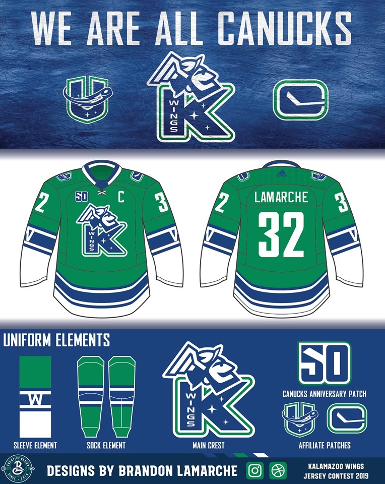
The second-place finisher played off the Canucks’ alternate logo introduced in 2007 that features Johnny Canucks’ head atop a stylized “V.” Designer Brandon Lamarche placed the head atop a “K” instead and added a winged helmet, like that worn by the Greek god Hermes, in place of Johnny’s toque.

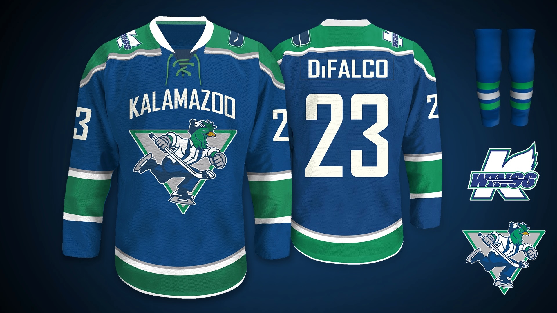
The third-place jersey from David DiFalco went a different route, keeping Johnny Canucks’ body and toque, but replacing his bearded visage with a stylized rendition of Slappy, the K-Wings’ mascot. It’s a fun and unexpected look that also added a “KALAMAZOO” wordmark across the top, much like the Canucks’ jerseys of the past decade.

One of the things that separates the skate logo from these two designs is how it incorporates the K-Wings’ current colours, rather than using Canucks’ colours. It’s a smart design choice that makes it stand out specifically as a Kalamazoo jersey, despite the re-designed Canucks’ logo.
Overall, this seems like a very fun contest for the K-Wings and it raises the question of how a similar contest would look for the Canucks. The team has a history full of many varied jersey designs from which to draw inspiration and there’s a big community of designers in the hockey world that would lead to a lot of great submissions.
What would you do if you could design your own Canucks jersey?


