As Bill Shakespeare once said, “What’s in a name?”
When the AHL last came to Abbotsford as an affiliate for the Calgary Flames, they chose a name and branding that was too closely connected to their parent club for a team smack dab in the middle of Canucks country. That wasn’t the only reason the Abbotsford Heat didn’t last long as a franchise, but it didn’t help.
The Vancouver Canucks, at least, won’t face that problem as they bring their AHL affiliate to Abbotsford. A close connection to the Canucks can only help endear the new team to the fanbase in the Fraser Valley.
At least, that’s what the Canucks hope is the case because the name of the Canucks’ new AHL affiliate is literally the Canucks.
The Abbotsford Canucks made their debut on social media on Wednesday with an all-too-brief video.
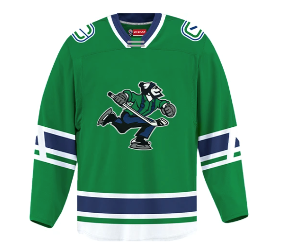
The launch came with a rollout of the team’s new logo, which isn’t a new logo at all. Instead, the Abbotsford Canucks will be using the NHL team’s alternate Johnny Canuck logo, which is a throwback to the logo worn by the team when they were in the WHL.
The Johnny Canuck logo is popular among a segment of the Canucks fanbase, who have clamoured for the logo to make a return as the main logo. That segment now gets their wish, albeit on the team’s AHL jersey.
 The new Abbotsford Canucks jersey for Vancouver's AHL affiliate.
According to the Abbotsford Canucks’ new website, the team chose the logo in order to pay homage to their roots and not because they already had the logo and trademark readily available.
The colours of the jersey are apparently field green, pacific blue, valley fog, fraser navy, and mountain white, with an inverted “V” on the sleeves to look like an “A” for Abbotsford.
Other names that were being considered for the team's AHL affiliate included aviation-themed names like Aces, Aeros, Aviators, and Pilots, as well as another throwback to Vancouver's hockey history, the Millionaires.
The Abbotsford Canucks will play in the AHL’s Pacific Division in the coming season, which is scheduled to begin on October 15.


