The Canucks’ Flying-V jersey is one of the most polarizing jerseys in sports history. The large chunk of people — perhaps the vast majority — think it’s one of the ugliest jerseys of all time and it’s a mainstay of any “Worst jerseys” list. Those who like the jersey, however, love it a lot and it’s undeniably one of the most unique jerseys of all time.
One of the (many) complaints from the jersey’s detractors is that the move to the reddish-orange, yellow, and black of the Flying-V jersey took the Canucks away from one of the most aesthetically-pleasing colour combinations in the NHL: the original royal blue and kelly green of the 70’s that was brought back in the late 2000’s.
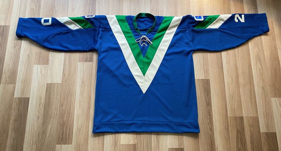
What if, however, you took the bold diagonal V design of the Flying-V jersey and paired it with the classic blue, green, and white of the original stick-in-rink jersey?
It’s a question that numerous designers have tackled, producing numerous variations on a blue, green, and white Flying-V. One designer decided to take it a step further, however, and actually made a blue, green, and white Flying-V jersey.
And it’s gorgeous.
Made myself a blue V jersey. Had to wait to get off white material to match the vintage felt crests. Goalie George Gardner wore 20 as the team had 3 goalies the first year. Contrasting satin nameplate based on the Nov 2/77 game.@UniWatch @PhilHecken @PaulChapman_ pic.twitter.com/UwlKarU5p2
— Wafflebored (@wafflebored) February 4, 2020
I had to know more, so I reached out to the Vancouver-based creator of the jersey, who goes by the name Wafflebored on Twitter. His website is a cornucopia of wonderful and bizarre custom-designed sports jerseys, from fun redesigns of typical jerseys to fanciful baseball-hockey hybrids.
“I have been making jerseys since about 2013,” he said. “I have made many jerseys, but the V style is by far the most difficult. It took me a long time to figure it out — it owes nothing to standard jersey design.”
He pointed out that the unique diagonal elements of the V design required the patterns to be made by a flag manufacturing company, as originally reported by Jim Taylor back in 1978. Without a flag manufacturing company handy, he mostly had to figure it out by trial and error.
“The secret: the V points at the shoulder angle back more than you would think and are not symmetrical,” he said. “Once I got that, the rest came together.”
Once it’s pointed out, it’s hard to miss. The top of the V actually curls over the top of the shoulder, then angles sharply back into the middle towards the top of the namebar. Trying to make it more symmetrical, as most would naturally be inclined, would make it look all wrong.
Embed from Getty ImagesFor the name and number on the back, he went with George Gardner, who started the first ever game for the Canucks. Strangely, he chose the number 20, when Gardner wore four different numbers with the Canucks, including the more traditional number 1. Why Gardner and why 20?
“I’m an ex-goalie and love all goalie stuff so I try to make goalie jerseys,” he explained. “I also love weird numbers: Gardner wore 20 in 1970 so it’s a perfect combination of number and goalie.”
This isn’t the first time Wafflebored has made a custom V jersey. He previously made another hybrid V jersey from another era of Canucks hockey, the West Coast Express era.
 Custom-designed Flying-V Canucks jersey. photo: Wafflebored
“I used silver dazzle cloth like the originals, which really stands out,” he said.
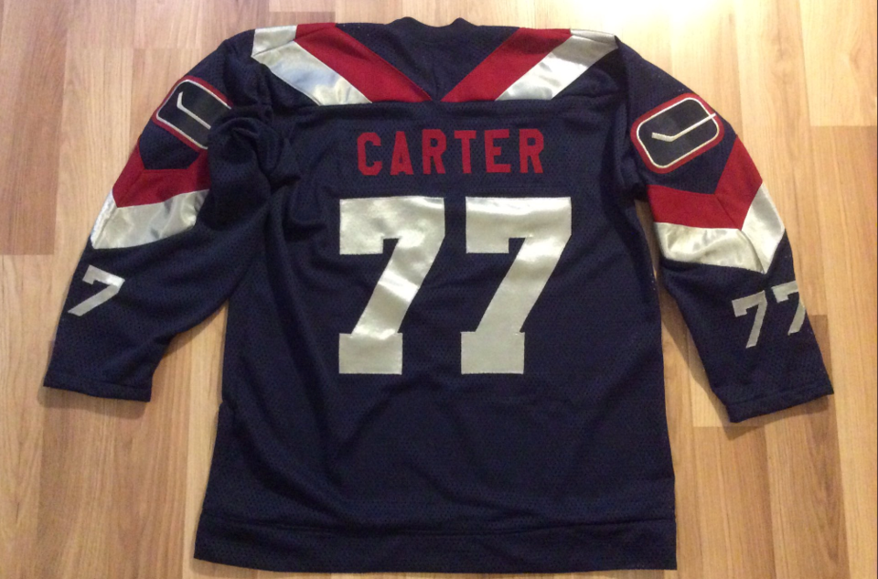 Custom-designed Anson Carter jersey. photo: Wafflebored
His most off-the-wall V jersey, however, was the one where he combined the two Vancouver teams from the 70’s, the Canucks and the Blazers of the WHA.
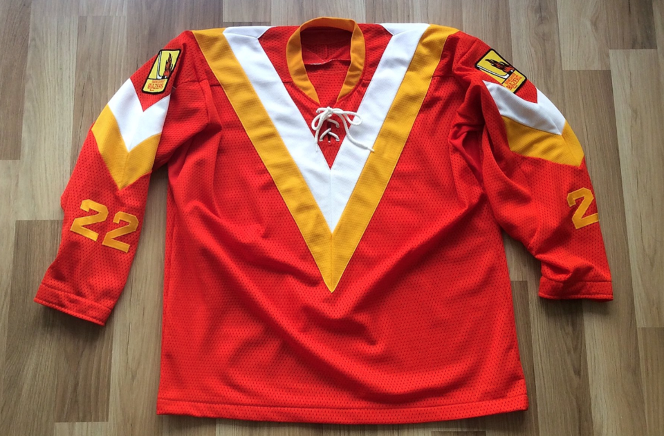 Custom-designed Canucks/Blazers hybrid jersey. photo: Wafflebored
Each of these jerseys is one-of-a-kind, but the Canucks/Blazers hybrid certainly stands out as particularly unique.
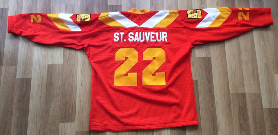 Custom-designed Claude St. Sauveur jersey. photo: Wafflebored
Neither of those two compare to the blue and green colour palette of his latest jersey creation.
His greatest creation, however, might be his nod to Towel Power from 2015: a Canucks jersey made entirely out of white terry cloth, complete with redesigned stick-in-rink logo that reoriented the stick into Roger Neilson’s famous white flag of surrender to the referees from the 1982 playoff run.
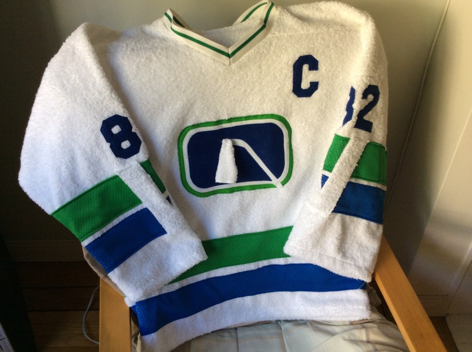 Custom-designed terry cloth Towel Power Canucks jersey
The terry cloth jersey isn’t particularly practical, of course, but the blue and green Flying-V looks like a jersey the Canucks could actually wear out onto the ice. It would make for a fantastic third jersey, in my opinion, but I’ve always had a soft spot for the Flying-V.
What do you think: should the Canucks adopt this retro V jersey as a third jersey?
