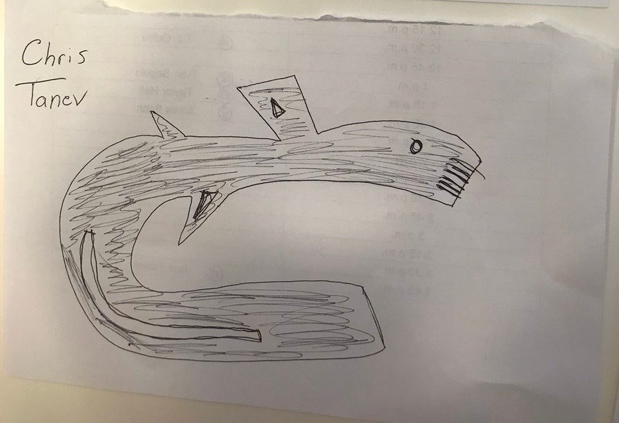
Bo Horvat was going to be the Canucks’ representative at the NHL Media Day, but since he still doesn’t have a new contract, Chris Tanev was sent in his stead. The annual event involves both interviews and promotional video and photo shoots, so you can expect to see plenty of Tanev in the NHL’s marketing of the Canucks this season.
We’ve seen some behind-the-scene glimpses of Tanev on social media and they have been universally delightful.
There’s Dramatic Lighting Chris Tanev...
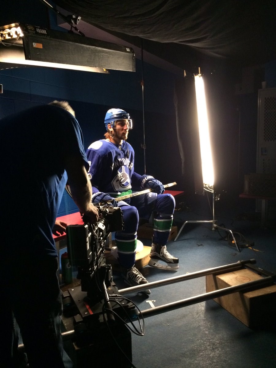
Source: @Canucks on Twitter
...Good With Kids Chris Tanev…
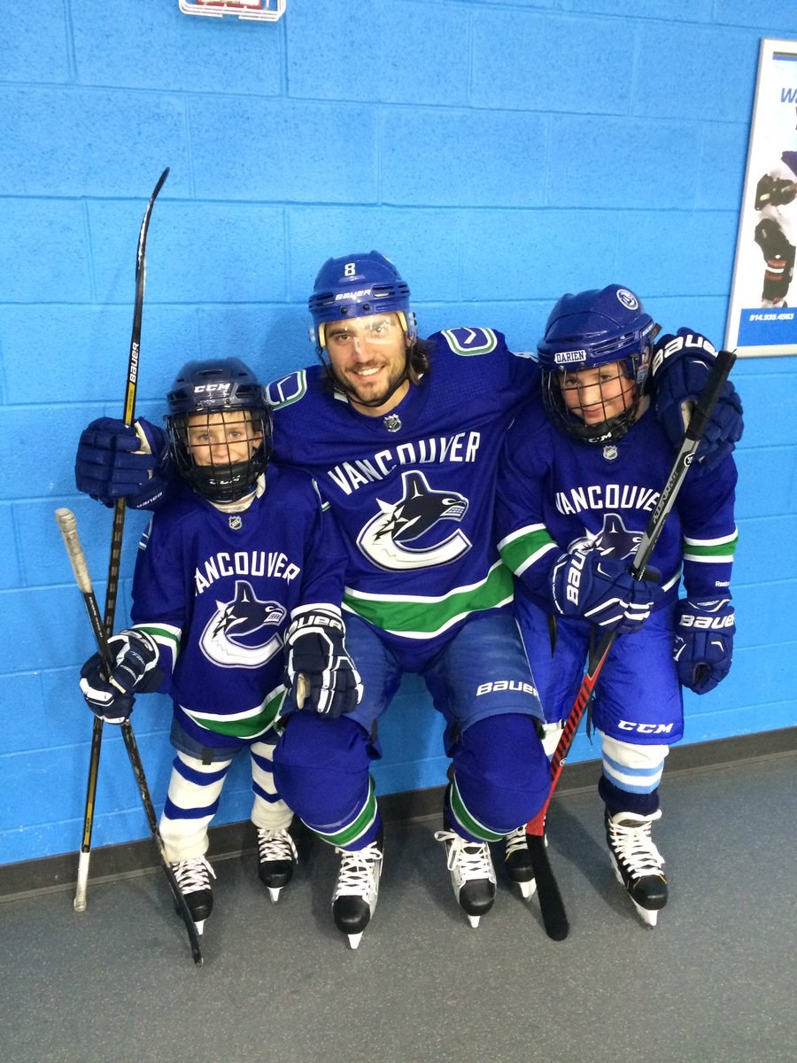
Source: @Canucks on Twitter
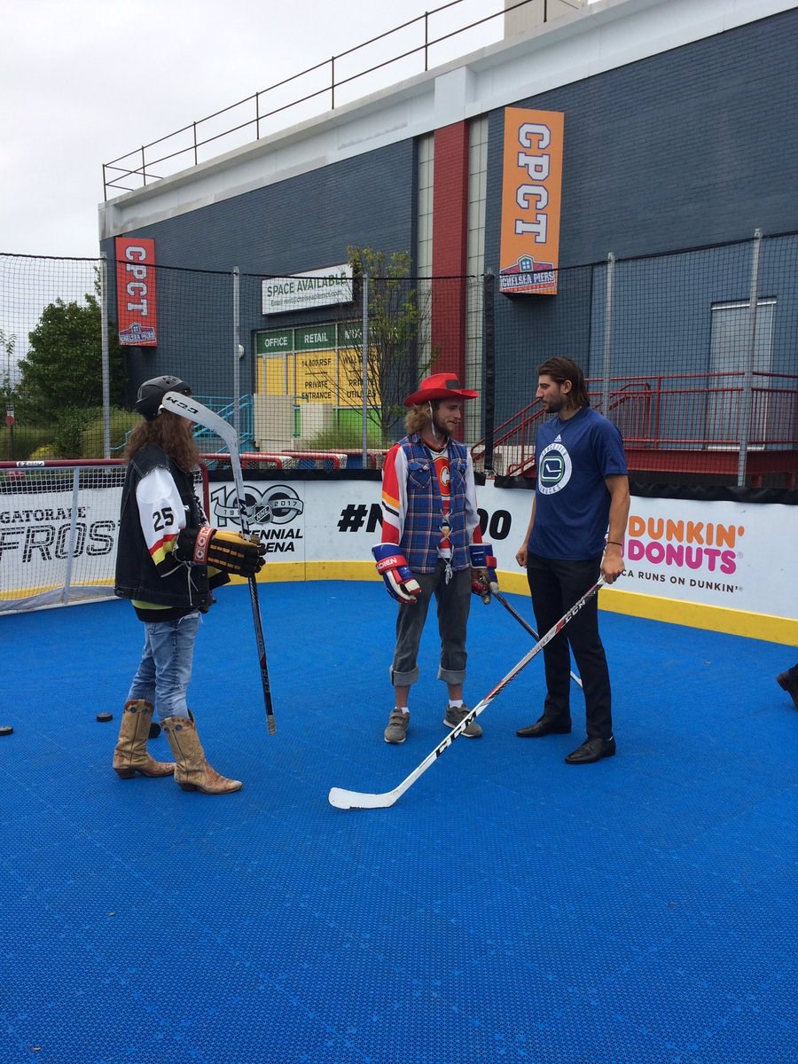
...Road Hockey in Dress Shoes Chris Tanev…
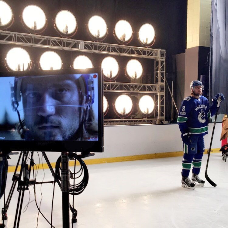
...Production Values Chris Tanev…
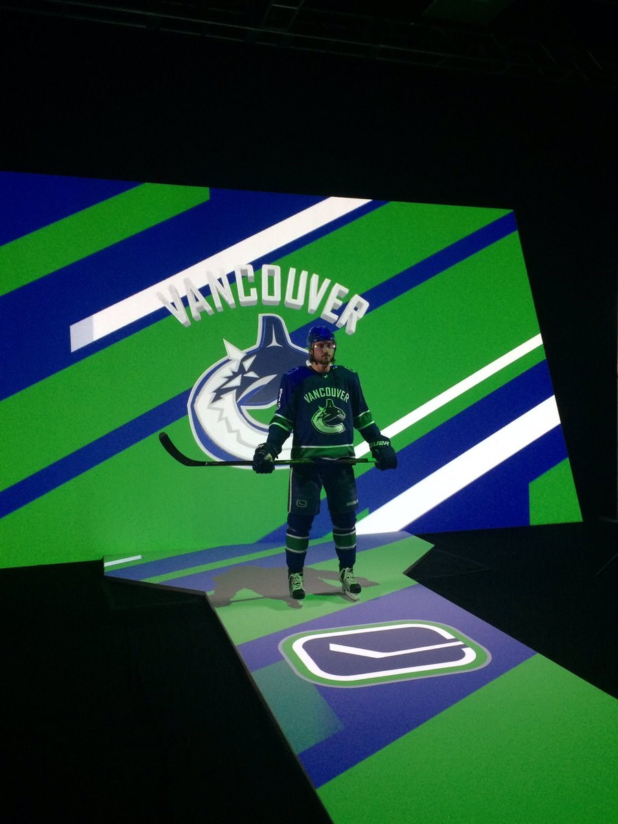
...Mean Muggin’ Chris Tanev…
...and the incomparable Male Model Chris Tanev.
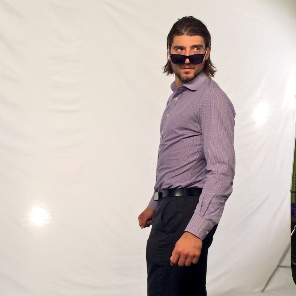
This definitively tells us that Tanev should be put into more awkward photo shoot situations, because the results speak for themselves. But he should never ever again be asked to draw anything.
The NHL asked several players to doodle their respective team’s logos. Some turned out better than others — Max Domi’s Coyotes logo turned out surprisingly well — while others had a tougher time. But the worst doodle undoubtedly belonged to Tanev.

That is gloriously disastrous and I couldn’t be prouder of Tanev for committing to the terrible job he was doing by aggressively colouring in the whole thing.
Some Canucks fans on Twitter were willing to give Tanev the benefit of the doubt. After I suggested Tanev had never looked down at the logo on his own jersey, Graham was quick to reply.
I mean... He's a heads-up D-man
— Graham (@firestorm_3) September 7, 2017
ZeroTenacity thinks Tanev’s version is actually an improvement.
tbh, he left off the 'Vancouver' word mark, so this is instantly better than the original.
— ZᴇʀᴏTᴇɴᴀᴄɪᴛʏ (@ZeroTenacity) September 7, 2017
Meanwhile, smoothmedia thinks that Tanev has discovered a new species.
TIL The Canucks logo does not feature an Orca but rather the very rare and elusive Concaveback Whale
— smoothmedia (@smoothmedia) September 7, 2017
Honestly, Tanev’s logo looks a lot better when it’s on a jersey. You can almost excuse the proportions as being caused by folds in the fabric in this wonderful mock-up.
— Hopeful Charger fan (@boltup16) September 7, 2017
