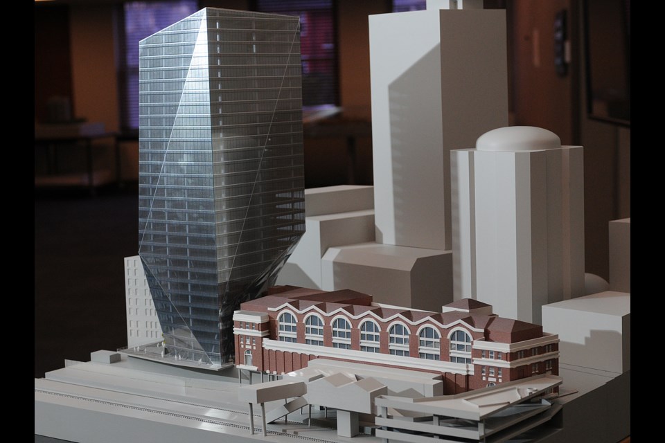
Bruce Knapp admits he’s surprised by the recent onslaught of criticism directed the Waterfront “origami” Tower proposed for 555 West Cordova St.
The 26-storey modern glass office highrise, proposed by Cadillac Fairview, is designed to sit next to the historic Waterfront Station and overhang part of the building. The Landing heritage building is on the other side. Critics, including Courier columnist Michael Geller, former city planner Ray Spaxman and heritage activists, have questioned the tower’s appearance, as well as its relationship to and proximity to the adjacent heritage buildings.
“Design always attracts discussion, but I think the level of criticism is quite unexpected,” Knapp told the Courier Monday.
Knapp is managing principal of B+H Architects’ Vancouver office. Adrian Smith and Gordon Gill Architecture designed the tower, but as an international firm, it’s required to team up with a local collaborating firm on the project, which in this case is B+H Architects.
The project goes before the city’s Urban Design Panel Jan. 28, which Smith and Gill plan to attend. Brian Jackson, the city’s manager of planning and development, says if the UDP supports the application the city will set up a public open house before the application goes before the Development Permit Board in March. (The UDP could also recommend a re-design.) More than 100 people have already submitted feedback to the city about the project.
Knapp maintains the building responds to site conditions and the city’s guidelines, urban design objectives and overall development plans for this part of Vancouver. He added that the design team has been working with city staff for more than a year to come up with an appropriate application and it’s going through all the proper reviews.
“I think the challenge that Smith and Gill were brought into is it’s a challenging site and it’s a significant design challenge to place a new office building in this part of the city,” Knapp said.
“The major thing that Adrian and Gordon are trying to achieve is how this tower comes down to the ground, comes down to the street and the plaza adjacent to what they also believe [are] significant heritage buildings on both sides. I don’t think the heritage buildings are being disregarded in any way. It’s really trying to figure out what’s the best solution for a tower that is taller than both of them to come down to the street.”
Jim Vasto, project manager for B+H, said that the tower “yields” to the heritage building and bends out of its way to form what’s been described as the origami shape.
While the look of the building has been debated, Knapp said it’s designed to deviate from a traditional shaft-like imposing tower.
“If you look over at the plaza building at the foot of Hastings, there’s a large concrete building with openings. It’s very imposing. Adjacent buildings are large, masonry brick buildings with large openings. So something that was not glassy or quite transparent, I think, would be even more imposing for the size of these [heritage] buildings," he said.
"So, obviously the decision to go with a very high performance, custom façade of glass was the approach and then to try and work all the sides of the building to really not make a big shaft tower. That’s why you can see all the facades push out and then pull back in — so an almost sculpted or faceted tower was thought to be the answer… I think [Gordon and Gill] were trying to get a distinctive and appropriate building expression from all the vantage points.”
Knapp believes some of the negative reaction is based on a lack of understanding about what the city is trying to accomplish in the area through new street extentions, landscaping and building sites.
Although the Vancouver Heritage Commission supported the project at its meeting in early December, the two members who voted against it, Anthony Norfolk and Michael Kluckner, remain critical.
Norfolk says he’s received support from the public about his criticism of the project and that the common theme has been the failure of the proposed tower to relate respectfully to the station and The Landing.
Vasto said a disproportionate amount of negative comments have been printed considering the majority of heritage commission members supported the project.
While some question whether a building should overhang a building, Knapp said the overhang takes place quite high up in the air.
“It’s not a situation where the building is trying to look like it’s landing on another one or is built out of another adjacent building,” he said. “And that’s a condition we’ve seen in a lot of buildings in Vancouver where heritage buildings are stripped down, slapped up against the side of another building and people call it a day. So that overhang is of some discussion. It’s not something that would be typically done, but given the constraints on other parts of the site to achieve the roadway down to the waterfront, to achieve generosity in the roadway width and building setbacks, it’s resulted in this. And it seemed to be acceptable enough to make the submission on that basis.”
[email protected]
twitter.com/naoibh


