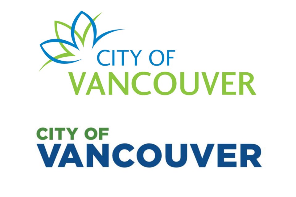
The City of Vancouver may keep its old logo, after all.
Or, at least, the proposed new city logo that raised the ire of local designers last week when council voted 8-2 to go ahead with it will get a second look — or scrapped altogether. The city spent $8,000 to hire a company to create the new logo, which designers described as “an insult to the design and creative sector.”
Mayor Gregor Robertson, who is not a fan of the old logo and praised the new design at council last week, issued a statement Tuesday saying he asked city manager Sadhu Johnston to “not put the wordmark on any permanent city assets” until the city consults with designers and the public.
“I take the concerns of Vancouver’s design community seriously about how a new wordmark reflects on the city’s brand and image, and speaks to who we are,” the mayor wrote. “While there will never be a single design that satisfies everyone, over the last week, there have been some compelling cases raised about why a different approach is needed.”
That backlash was led by local art director Brock Ellis, who co-wrote an open letter with members of the design and digital community to the city asking that the proposed design be rejected. The letter was signed by hundreds of design professionals, including employees of Electronic Arts and Skyrocket Digital.
“It is an insult to Vancouverites and all who love our city,” the letter said. “This is not a debate about whether the Optima or Gotham typeface is better or whether a logo is a wordmark or a rebrand. This is a debate about valuing our civic identity and the city’s value of our creative and innovation sectors. You have severely missed the mark with this wordmark, City of Vancouver and council. Please, spare us from this new logo. This is not my Vancouver. This is not our Vancouver.”
The proposed logo is done in Gotham font face, with a smaller point-sized “City of” in green stacked on a larger point-sized “Vancouver” in blue. It was supposed to replace a similar logo, set off by a lotus petal design.
In a Feb. 22 debate at city hall on the proposed logo, Robertson described the current logo as “lame.”
“It clearly isn’t doing its job anymore,” the mayor said. “And I think many would say it never really did its job as a bland logo with a squiggly bit on it that doesn’t mean anything to many people.”
A city report that went before council said the proposed logo “presents an updated image of the City of Vancouver as a modern, innovative and highly desirable place to live and work.” The report added the city’s “visual identity” had not been updated in more than 10 years.
“A simpler visual identity will not only be more easily recognized and understood by those for whom English is not a first language, but can be more easily adapted for social media channels,” the report said.
NPA Coun. George Affleck, who voted against the new logo because there was no public input on its choice, accused Robertson and his Vision Vancouver councillors of flip-flopping on their decision. Affleck joked on Twitter about the mayor’s turnaround with a logo, in green and blue, that read “flip flop.”
Vision Vancouver have a new logo. It was a committee of one decision. Font choice: Gregor. What do you think, #vanpoli? pic.twitter.com/SZ3gABcXkP
— George Affleck (@george_affleck) March 1, 2017
@Howellings


