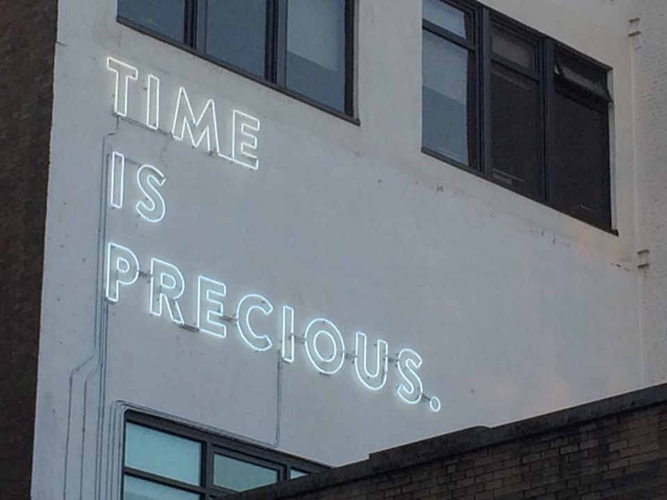
On a recent night ambling with friends through Gastown I caught sight of a glowing message on the side of a building on Water Street. The large neon letters read, “TIME IS PRECIOUS.”
John James Wilson, son of Lululemon founder Chip Wilson, explained the origin of the message to the Gastown Gazette back in January: “My family owns the building and we wanted to use the visual space as an area to gift the city a piece of art. Shannon Wilson [Chip Wilson’s wife] and myself recently started Kit and Ace and our product is designed with time in mind.”
No denying that. “Time is precious” is all over the promotional material for Kit and Ace, a ritzy fashion store targeting consumers with “high-contact lifestyles.” The outlet on Water Street is a short distance from the neon-decorated building owned by the Wilsons.
In November 2014, a Kit and Ace outlet opened on Whtye Avenue in Edmonton, with “Time is Precious” emblazoned above the store’s entrance. “This Mother’s Day, (quality) time is precious,” announces a post from last May on the Kit and Ace Facebook page. “We believe time is precious and the less time you spend taking care of the clothes, the more time you have to go do things that matter more to you,” JJ Wilson is quoted on stylecalling.com.
Given the pedigree of this expression in Kit and Ace promotional material, the 8x17-foot sign on Water Street seems more like an inert gas advertisement for technical cashmere than a piece of art. But the Wilsons are free to pitch anything they want to the city, for the facade of any building they own. The problem lies in Vancouver’s approval process of public art.
According to City of Vancouver’s policy documents, “Public art in Vancouver should identify, explore and articulate the evolving nature of the public realm in the constantly changing city.” It should also “enrich the quality, character and experience of the public realm and public infrastructure that are built by the public and private sector.”
Perhaps most importantly, it should “be challenging, risk-taking, creative and innovative” and “reflect the image, character and meaning of the city as understood by its diverse communities.”
Go take a look yourself, and decide if the neon artwork on Water Street meets any of those criteria.
“The application to install a neon artwork application ‘Time is Precious’… does not meet the sign criteria, it cannot be processed as a sign application,” according to minutes by the Gastown Historic Area Planning Committee from Sept. 17, 2014. A motion that the committee “generally supports the proposed artwork installation at 21 Water St. as an art form,” with some structural modifications, was carried at the meeting unanimously.
Confused, I contacted the Public Art Committee for some clarification. Didn’t this gift to the city, determined to be art, go before them for approval?
“To confirm: this project did not come to Public Art for review, it is not a formal gift to the City or it would have gone through the Public Art Committee as a donation,” responded Jason Watson of the city’s communication department in an email.
So that makes “Time is Precious” an informal gift to the city that was approved in general as art by the Heritage Committee, but bypassed the Public Art Committee because it’s not a donation.
It’s not even a sign. I think I’d have an easier time wrapping my head around the Higgs Boson particle. In any case, the proposal received a development permit on Oct. 17, 2014.
This all might seem like a tempest in a sign shop, considering the association of art and branding dates back further than Andy Warhol’s ’60s-era, silkscreened Campbell’s Soup cans. And in a city with an out-of-control real estate market and the poorest postal code in Canada, the ambiguous nature of a neon message in Gastown is likely to remain way down the list of civic controversies.
Yet this matter connects to the increasing penetration of the commons by the commercial, the adulteration of the urban environment with marketing memes and the compromised integrity of city historic areas. Perhaps over time a number of letters will fizzle out on “TIME IS PRECIOUS,” highlighting an alternate view of this piece of art: SPECIOUS.


