The tastemakers and paint lickers at Pantone and Benjamin Moore have announced their colours of the year for 2017 and, as with previous years, they did not disappoint in their ability to disappoint.
Where to begin.
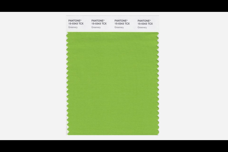
Following up its confounding stripper-named choices of Rose Quartz and Serenity as 2016’s colour of the year, the peeps at Pantone announced that 2017 will be the year of “Greenery.” Not green, but greenery. Describing the colour as “symbolic of new beginnings,” Pantone went on to call greenery “a life-affirming shade… emblematic of personal passions and vitality.”
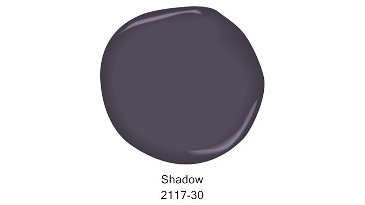
Not to be outdone, the hue whores at Benjamin Moore have opted for “Shadow” as its colour of 2017, an about face from 2016’s politically prophetic choice “Simply White.”

Creative director Ellen O’Neill says Shadow “ebbs and flows with its surroundings, and brings it to life. Rich, royal amethyst can fade into the soft lilac-grey of distant mountains or morph into lustrous coal.” Is it getting hot in here?
Sadly, once again, both Pantone and Benjamin Moore ignored K&K’s persistent lobbying to consider our own nominations for Colour of the Year. In no particular order, they are:
*Worrisome Mole. It looks benign and inoffensive, but why take the risk.
*Midlife Beige. Touted as the colour every tired man in his 40s to 50s wears with a shrug because he no longer feels the need to impress anyone, least of all himself.
*Cat Ass. That unnervingly pink hue of your beloved feline’s behind that is always pointed in your direction for some reason.
*Midnight Poutine. As initially enticing as it is regretful the next morning.
*Vague Stain. Is that bacon grease? Dried gravy? Or just faded fabric? It’s just so hard to tell until it catches the light at a certain angle. And didn’t you just wash that shirt? Or is this the shirt that you continue to pick up off the floor and put on, thus inadvertently avoiding the wash for the second week in a row. But it looks so good and slimming. Surely nobody will notice if you wear it again. You hope.


