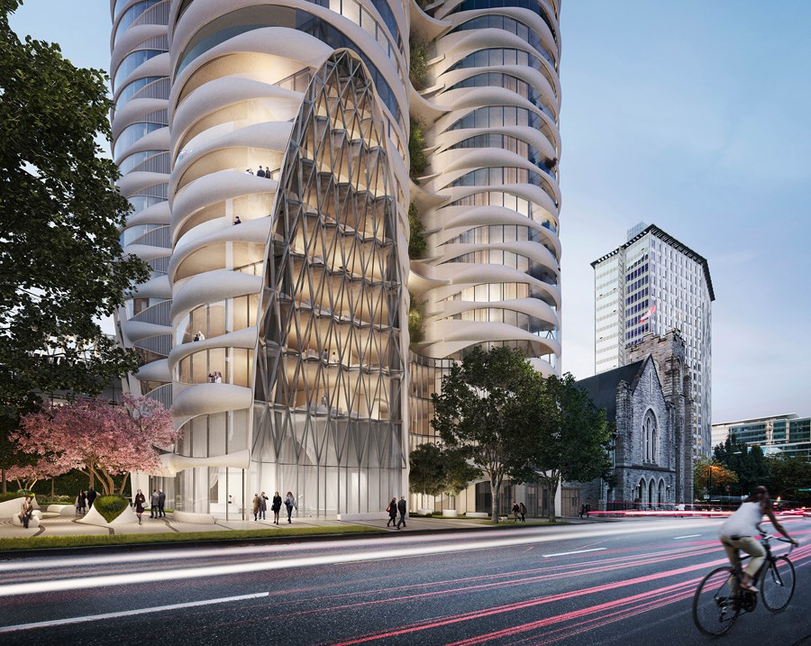
The concept of transformation is one of the ideas that informed the design of The Butterfly building destined for 969 Burrard St. behind First Baptist Church, says Venelin Kokalov.
Kokalov is the design principal of Revery Architecture (formerly Bing Thom Architects) and the lead on The Butterfly, which is being developed by Westbank. It is one of the last projects Bing Thom of Bing Thom Architects was involved in before he died in 2016. Kokalov worked closely with Thom for 16 years.
Construction on the building is expected to start this December. The sculpted facade features high-performance curved double glazing with high-quality insulated precast white panels. The building includes "sky gardens" in open-air breezeways on each level, and tree planters on every third floor.
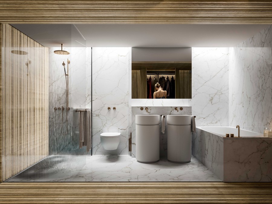
Glass walls were used for the second bedrooms in the units and the washrooms. For the washrooms, the glass is back-painted for privacy; for the bedrooms, it’s transparent with curtains. There will be a 50-metre, Olympic-length pool, and the overall development project includes a building with 61 units of social housing to the west of the tower and seismic upgrades and restoration work to the church.
The Courier spoke to Kokalov about the inspiration behind the tower's design.
He noted it was influenced by Thom’s overall philosophy that no matter what you dream, don’t forget the fundamentals such as nature, light, natural ventilation and natural materials. He said Thom typically wasn’t as interested in residential projects — his firm was more focused on projects such as performing arts centres — but Thom was convinced by Westbank founder Ian Gillespie to sign on.
“[Thom] told me Ian is like us. He understands architecture, he values architecture, he wants to improve the quality of life, he wants to improve the city of Vancouver. This stimulates us to go and do this building,” Kokalov said.
Why is the building named The Butterfly?
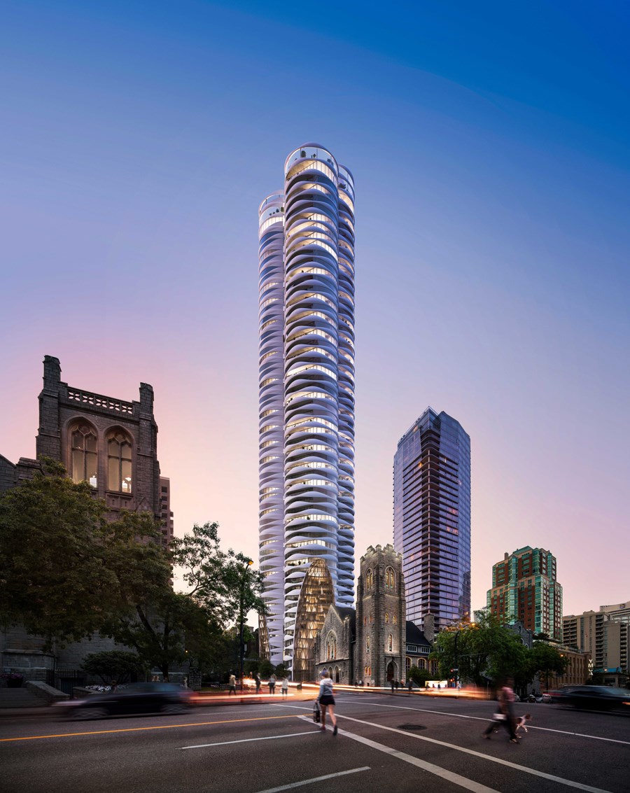
We wanted to create a building to symbolize elegance, grace and beauty. The butterfly is a symbol of this elegance and grace. When you see it, you love it. Also butterflies are in constant change.
We created these sky gardens — you arrive into these gardens and you are always surprised… in the morning you get this fresh air, sometimes it’s rainy, sometimes it’s a sunny day. The trees change through the year. You see the sky, moving clouds — all these elements of nature are in constant change, the same way as The Butterfly.
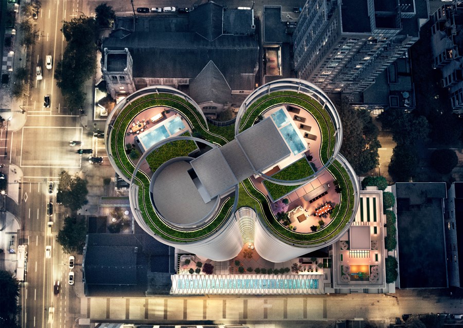
When you look at it from above, it has that butterfly shape.
Yes, it is something like that, but I can tell you it didn’t start from there. In the beginning what happened is we wanted to respect the church. The design was oriented more about the pipe organs, and the cut-outs at the bottom was a different approach. But the name of Butterfly is more related to this transformation of experiences. Inside, the apartments are also transforming because [we're] using these glass walls and curtains that you can make your living room bigger and smaller by using the curtains in the apartment [in] your bedroom. So you’re always arriving to a different atmosphere in your apartment.
Were there other inspirations? You mentioned gardens.
Gardens are on every floor. The concept of the building is we want to break the typologies of the city. We tried to create new experiences. As you know, living in a high-rise tower, you’re arriving to a dark space and you go into your apartment. In our case, you’re arriving to the garden. We want to create homes in the sky. You arrive to your floor, you go outside from the elevator [and] you’re in the fresh air with trees and flowers around you. Then you enter into your apartment.
This space that we call sky gardens creates community interaction because these days the social life is tough when you work for a living. Also, we don’t want to clone the tower. In Vancouver, all the towers are cloned, they’re the same. You’re not surprised. It’s super boring. In our way, we tried to reinvent the tower to bring this new experience.
What are the most interesting features of the building to you, on the exterior or in the interior?
For me, breaking the typology of high-rise living is the most interesting [thing]. The second interesting thing is, for us, all our work is starting with people. Our design is emphasizing wellbeing and everything is about the experience. Then being comfortable and beautiful is the next step. The other interesting thing is the façade. The façade is pre-cast concrete — white, curved shapes that look like clouds. We’ve got this glazing that also will reflect the clouds. Imagine in one moment the building will blend with the sky. The curved glazing responds to the sky and the concrete is to the clouds.
The other interesting thing is the inside. We expanded the spaces through deleting the drywall and converting them to glass walls. This is also something that is unique. We [also] introduced a 50-metre pool… it’s the only one [this size], I believe, in a residential tower.
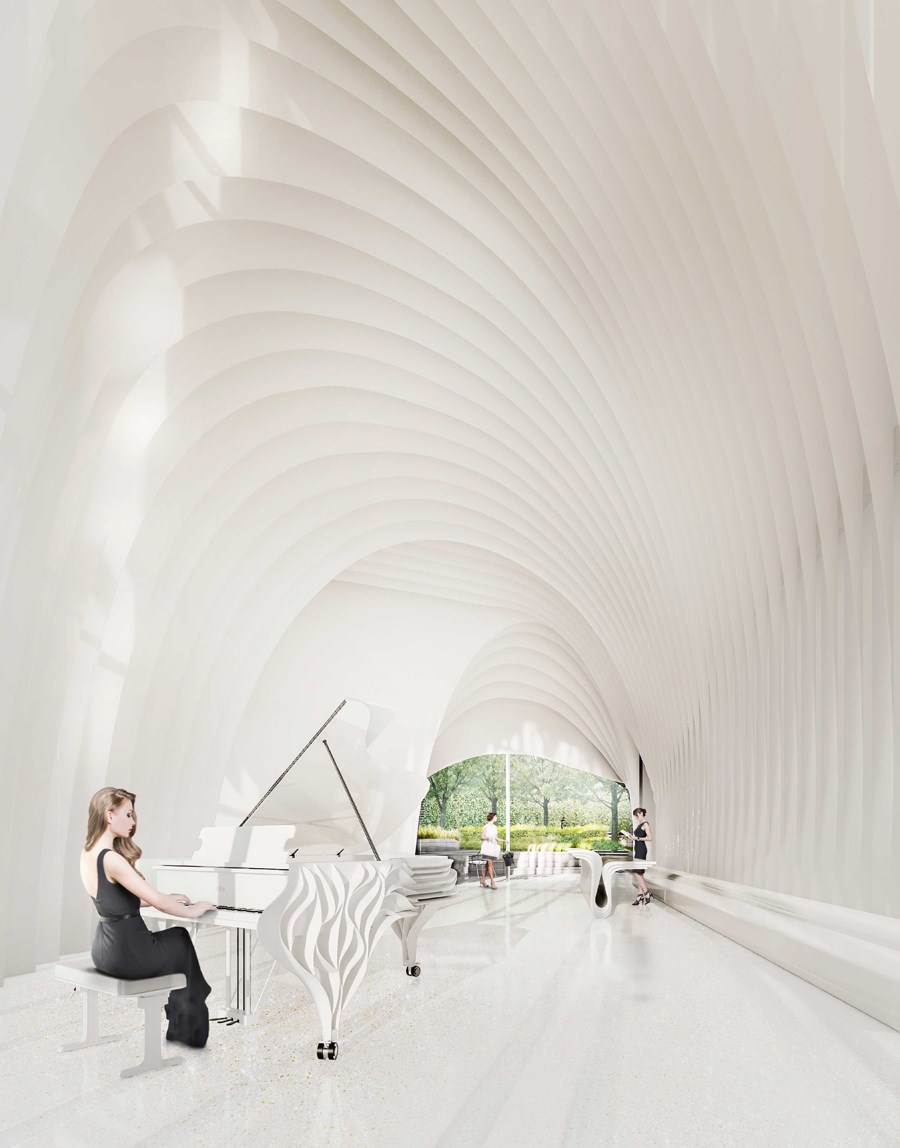
The ceiling above the pool and the ceiling above the lobby are very unusual.
Everything, for me, is based on experiences. When you enter the lobby, I wanted to detach the people from the noisy streets, from the outside. So you’re in a relaxing, really calm space. Sometimes you introduce the piano. I designed [the] piano. I dedicated it to Bing Thom as my gesture to my master.
I’m creating slow and fast places. In the lobby, you are in the slow space. You’re relaxing. Then you enter the elevator, which is a fast place — you’re moving to your floor. Then you’re in the garden, where, again, I slow you down because your senses start to react to the nature and react to what’s happening. Then you go to your apartment where the corridor is a fast pace. Then you arrive in the living room, which is a slow space. These transitions, these experiences, are bringing happiness to people.
And the ceiling on the pool, can you talk about the design?
The structure is also pre-cast concrete. It’s more dynamic because it’s different from the lobby because the pool is a place where you’re active, you’re moving, you are doing exercise. [This design] is more provoking movement and dynamics in this space. You feel under the sky, too.
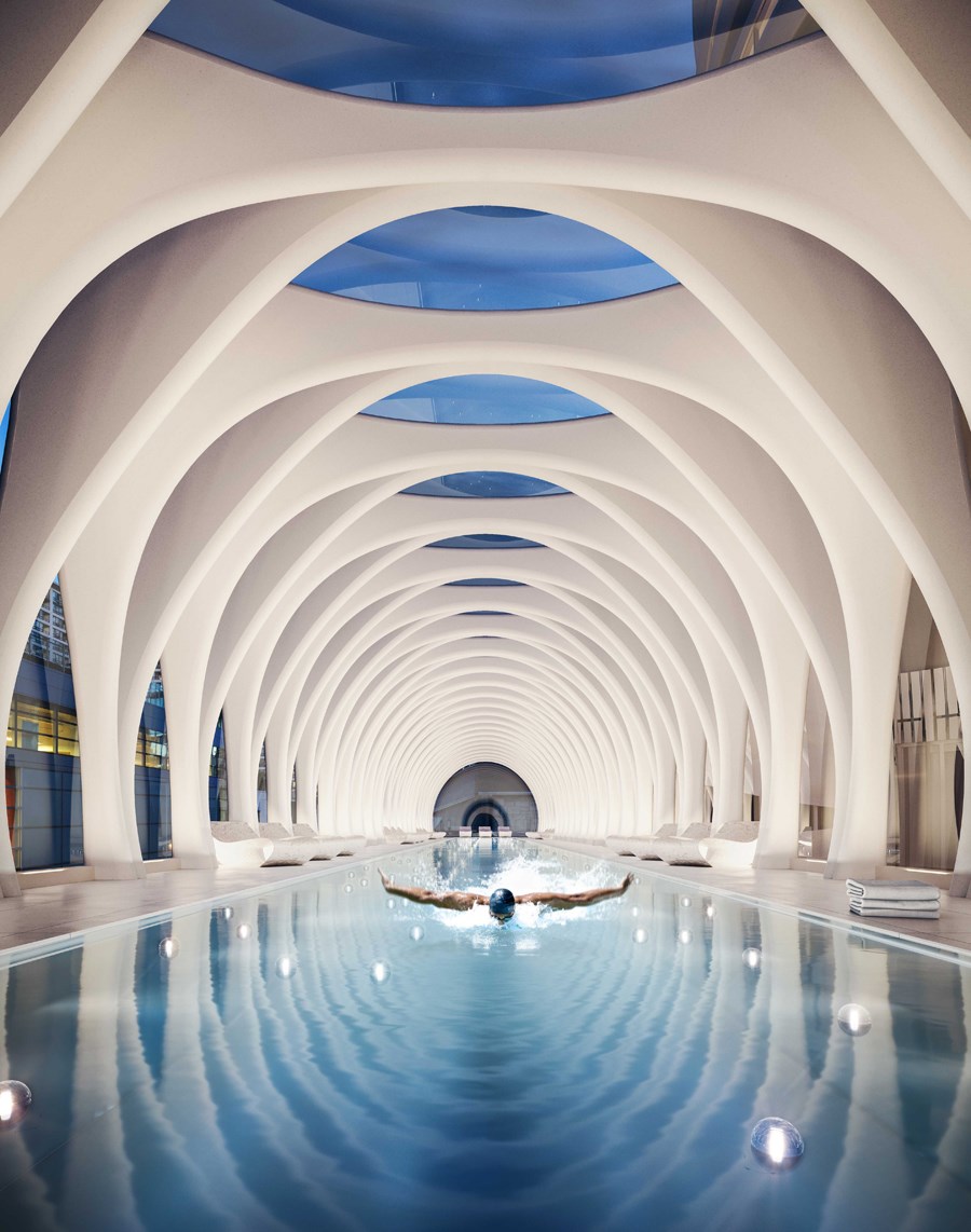
In recent years, more buildings in Vancouver seem to have distinctive designs. Why do you think that’s the case?
You have developers who have big dreams. And I highly appreciate that. In everything there is evolution. There is evolution in the city, there is evolution people... I believe in the city there is slower evolution compared to some other elements but we still need to move on. There are new generations coming in the future. We cannot slow that, we cannot be boring and be doing the same things that we’ve done 100 years ago or 50 years ago in the city. I believe it’s thanks to the visionary people.
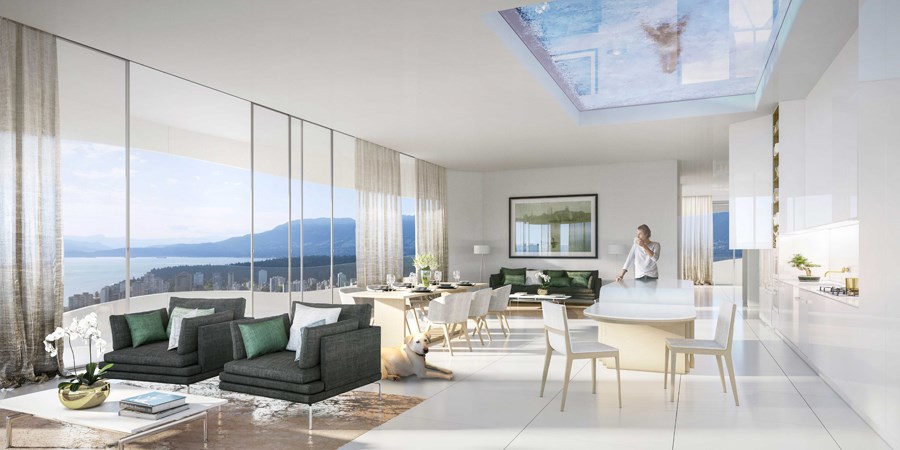
How does The Butterfly compare to other projects you’ve worked on?
Every project that I work on — it’s more than 100 — I’m emphasizing people.
First I draw the person, then I draw the walls around them. All our buildings are based on experiences. What I’m proud of in this building, compared to other buildings, is I managed to introduce experiences in the residential tower. That is very difficult. Usually when you draw museums or libraries or lobbies, it’s very easy to create the experience. You can create atriums [and other spaces]. In residential towers, it’s very difficult. So what I’m proud of with this building is I cracked the typology of the residential tower. We introduced this unique experience for the users but, in the same way, we create a unique experience for the people that are moving close by because I believe this building is beautiful and we need this type of pleasure [in] Vancouver.
Read more details about the project here.
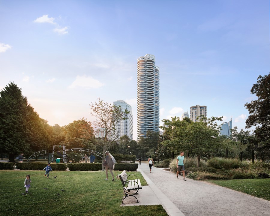
@naoibh
