Whether you're a developer, architect, designer or layperson, everyone’s an expert when it comes to what makes for a good-looking building.
Brent Toderian, who runs Toderian UrbanWorks, pushed for “architecturally adventurous” ones in key locations during his six-year stint as the City of Vancouver’s chief planner.
But how the average person will perceive some of the increasingly creative designs coming to the streetscape and skyline is another matter. While some new or proposed buildings are viewed as welcome additions, others are judged more critically.
Consider Lululemon’s new 13-storey global headquarters proposed for Foley Street near Great Northern Way.
One city councillor described its design as “elegant” during a recent public hearing, while a planning consultant wrote on social media she hoped “this bulky overstuffed, dubiously designed building” wouldn’t be approved.
As of this writing, the fate of the building wasn’t known. Council is expected to wrap up a public hearing Jan. 30 on Lululemon’s application for a text amendment for additional height and uses on the Foley Street site. The company isn’t seeking additional density. (UPDATE: Council approved the text amendment. See story HERE.)
But a recent piece about the building in the Courier elicited this take from a reader: "Honestly what is up with craptastic architecture in this city. The same wavy weird features with some nature thrown in. What I would do for some brick and right angles..."
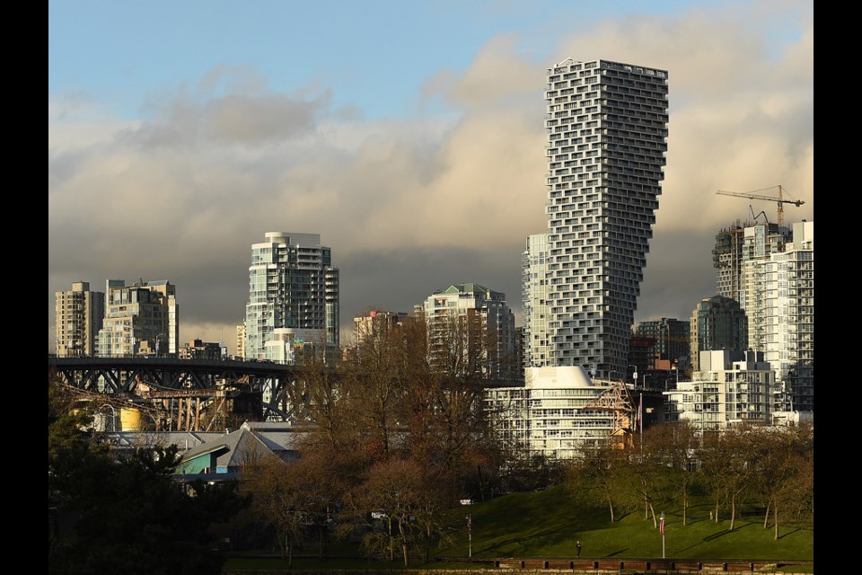
Westbank’s Vancouver House, the luxury residential building designed by Danish “starchitect” Bjarke Ingels of the firm BIG, is perhaps one of the most debated new buildings to emerge — fans see it as iconic and creative, critics see it as a monument to the excess of the city’s outrageously priced real estate market.
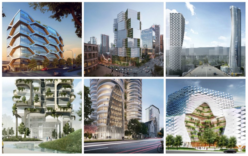
Vancouver House is not alone. Numerous architecturally interesting projects, both residential and office, are on Vancouver’s horizon. Some are towers in high-profile locations, others are more modestly sized buildings — among them, Nature’s Path’s 10-storey office building with its distinct honeycomb-like exterior and Bosa’s “Fifteen Fifteen,” a 42-storey tower described as a “three dimensional sculpture” that’s coming to Alberni Street.
Westbank is in the midst of constructing a 24-storey office building called Deloitte Summit on West Georgia featuring clusters of four-storey steel-framed cubes with “vertical gardens” on portions of the exterior, while Henson Developments has proposed a 60-storey curvy building for Nelson Street, with a column of greenery down its centre — its design inspired by the peninsula, the inlet and green forests.
For Toderian, aesthetics are important but so are context and fit.
“It doesn’t bother me at all that there’s going to be debates and discussion about architecture,” he said.
“But, fundamentally, I want the buildings to work, I want the buildings to work for their context, work for their place. So whether you like them or not, they work. And then it can just be a conversation about taste and taste can’t be regulated.”
A critical view
Vancouverite Andrew Longhurst is the author of the “craptastic” comment. He acknowledges being an armchair critic, having never studied architecture or design, but says he appreciates and loves cities — he’s completed a Master of Arts in Geography, with a focus on urban geography, from SFU where he’s currently a PhD student in geography.
He’s not thrilled with what he’s seeing on the architectural front.
“There are most certainly fads that go through design, but I feel like, in Vancouver, the development industry has done a good job of really branding itself with glass and nature as a motif and I think that carries through,” he told the Courier.
“We’re at the point now where you look at our skyline, you look at what's being built, and it is so monotonous. It is all largely the same or variations on a theme. It just seems lazy to me at the end of the day. From a design perspective, I just think, let's be a little more creative, and let's add some colour and life to our buildings.”
Longhurst is most weary of what he sees as the obsession with glass and towers; he prefers the warmth of brick, wood and other materials. He’s also not a fan of how some towers integrate with the landscape.
While he appreciates the look of old buildings such as the Lee Building, the Art Deco Marine building and the Dominion Building, he considers the futurist-looking towers that will be going up in the Oakridge Centre redevelopment “a disaster.”
“It’s this massive, massive complex of towers. Yet we know from a lot of urban theories, you need relatable landscapes where people can engage with the street,” he said.
Despite his architectural and design preferences, Longhurst is prepared to put them aside if a development produces more rental or affordable housing.
“Increasingly, for me, design is nice but I could care less. For me, it's increasingly dependent on what's the public benefit and what are we getting from development? Is it delivering any affordable housing or not? In many cases, it's not, so it's just a building I don't find aesthetically appealing and then on top of it, nothing affordable.”
Seeking architectural diversity
Criticism of the city’s architecture was on Toderian’s mind when he took on Vancouver’s chief planner role in 2006, which he held until 2012.
“One of the narratives I heard a lot when I arrived, and even before I arrived, when I would discuss Vancouver, was that the urbanism is great. The city building, the street design, the city planning is great, but why do all the buildings have to look the same?” said Toderian who, back in 2008, published a piece in a planning-related news website called Planetizen entitled “Does Vancouver need (or want) Iconic Architecture?”
He recalls some critics using “ugly” to describe the city’s architecture, which he considered a very powerful word.
“After some conversation, what I would come to understand is what they really meant was monotonous, not ugly, but it just all looked the same. It was boring. The conversation I wanted to spark, and that article was part of it, was we should have a conversation about more architectural diversity, more architectural variety, less monotonousness, less predictability, in the right places and the special places.”
Toderian talked about issues such as pattern and punctuation and special buildings versus background buildings, but he didn’t want the takeaway to be that the chief planner “wants us to design crazy buildings everywhere,” just in specific locations such as terminating views or framing a key street or high buildings that pop up above the skyline.
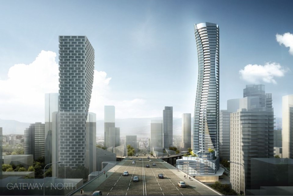
While the city already had a higher buildings policy, it was amended and strengthened around 2010. The planning department identified about six sites where particularly tall buildings could be constructed, one of which is at the north end of Granville Bridge where Vancouver House is now situated, while another site is opposite to Vancouver House where Pinnacle International hopes to build a tower. The goal is to create a “Granville Gateway” into and out of the downtown.
Such buildings face more stringent expectations in terms of architecture and green design.
The theory, according to Toderian, was to create “architecturally adventurous” buildings where it would do the most good in terms of changing the perspective about architectural monotony while not sacrificing the urbanism Vancouver was known for.
“The problem is often some architecturally adventurous buildings by famous architects are downright shitty buildings from the perspective of the street, the block and the neighbourhood. They are all object, no context,” he said.
“They land badly at the street, they have blank walls everywhere. They're very un-urban. They're all about architectural ego and not about supporting and contributing to their street, their block and their neighbourhood. My narrative was, yes, we want architectural adventurism in the right place, but never at the expense of those core values of [creating] urban buildings that strengthen the street and the block and the neighbourhood and [which] are green.”
The city started to see international architects teamed up with local architects — rare in the past — according to Toderian, which he maintains has created some of the most interesting buildings.
“Here’s the problem,” he added. “The architectural conversation too often is in the context of the high-market buildings, the boutique buildings, the expensive buildings for rich people. Whereas I always wanted the architectural conversation to be about buildings of every size, and scale and cost.”
Toderian noted some of the best architectural proposals he saw while chief planner were for the 12 social housing sites funded during the Olympics and built in the years after.
“We saw BC Housing building not only green buildings, LEED gold buildings, but also very architecturally interesting buildings without having to make them shaped like Marilyn Monroe. Just interesting material and interesting colours, which is something we seem almost allergic to architecturally in this city.”
“In a city of beige and green glass, any colour, if it’s well done, can result in more interesting architecture… colour is like any other aspect of design. If it's done well, it can really add to the architectural diversity and variety and interest.”
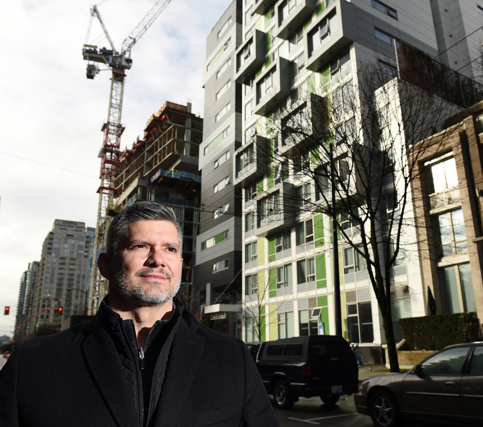
He cites Jubilee House, a social housing building at Richards and Helmcken, which features splashes of green and articulation of the façade, as a good example.
“This building illustrates that you don't need to do a lot to have better architecture. It's still largely a box [and] the building program is still very simple so it's very cost-effective,” he said.
“There's a false narrative out there that to get great architecture, it has to be expensive and it has to be bigger and taller than everything else. That's not true. And this building illustrates that.”
Form and function
Design can serve many purposes. Toderian points to Westbank’s Deloitte Summit building at 400 Georgia St., which is under construction.
He was a consultant on the project during the rezoning process. Not only does he think it will be a landmark building on Georgia Street, which he calls an important street in the economic health of the province, he said it’s designed to compete with buildings in other cities and attract market attention to Vancouver. Toderian calls it “architecture with a purpose.”
“That building is designed to have a major user say, 'Well, if I can go into that building, I'll go to Vancouver instead of Seattle.' That’s what that architecture can do,” he said.
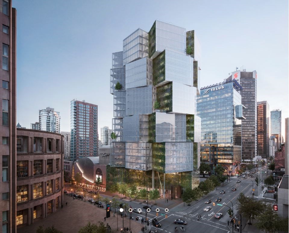
“It doesn't just make for a more interesting, significant corridor, and Georgia Street. It doesn't just contribute to a cultural precinct that has the library, the eventual new art gallery, the Post Office site, etc., it is going to contribute to a remarkable area of architecture and cultural uses, but it also helps make Vancouver more competitive, attracting talent to our city.”
While function is important, form is what catches attention and Vancouver House has done just that.
Toderian is more familiar with it than most. He’s friends with Ingels and was involved with the development at the city level and a little bit afterwards as an advisor.
While most of the focus has been on its shape, Toderian says the landing of the building and creation of the neighbourhood under the bridge is probably more important from an urban design point of view. He also likes the “skin” of the building.
“Even before you think about the shape, the modular nature of the skin is just remarkable and beautiful,” he said.
As for its shape, Toderian said it isn’t just interesting and unusual, it's "completely practical" in the context of what the building had to do to relate to the bridgehead.
"It's a building entirely driven by its context and its constraints. To me, that's perfect. It's a perfect example of what we're talking about — architecture that is pragmatic, that seeks to be adventurous, but not at the expense of its urbanism and its urban performance,” he said.
“The biggest challenge, of course, is it’s all done at a very high price point and it's very important that this architectural conversation we have be applicable to every price point, including social and affordable housing, because you shouldn't have to be an expensive building to be a great building.”
(See more images of developments that have been proposed or approved HERE.)
@naoibh
