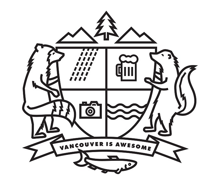
Earlier this year I wrote this post on our blog about our coat of arms and how I thought it was inappropriate for us to have a totem pole featured on it. It was originally there due to a decision that I personally made to put it there - I own that - and after many conversations the decision to remove the totem was made a few months ago. I've since commissioned local designer Jill Southern to hash out an updated version and I'm thrilled to share it with you today.

You may notice that we haven't simply removed the cultural appropriation but have taken this opportunity to refresh the overall style of it. Jill notes that "We went with something more modern and angular to complement the V.I.A. logo typeface. The simple, uniform lines allow it to be easily replicated on print and digital media at various sizes. The decorations in the crest symbolize the ocean, rain, and our city's food and arts scenes. Flanking it are local wildlife and natural surroundings. All in all, it's meant to reflect a fun, friendly vibe that is uniquely Vancouver."
You'll see our new coat of arms appear on our Facebook Page, Twitter and Instagram accounts, and maybe even on some things you'll be able to own in the coming months. Stay tuned!


