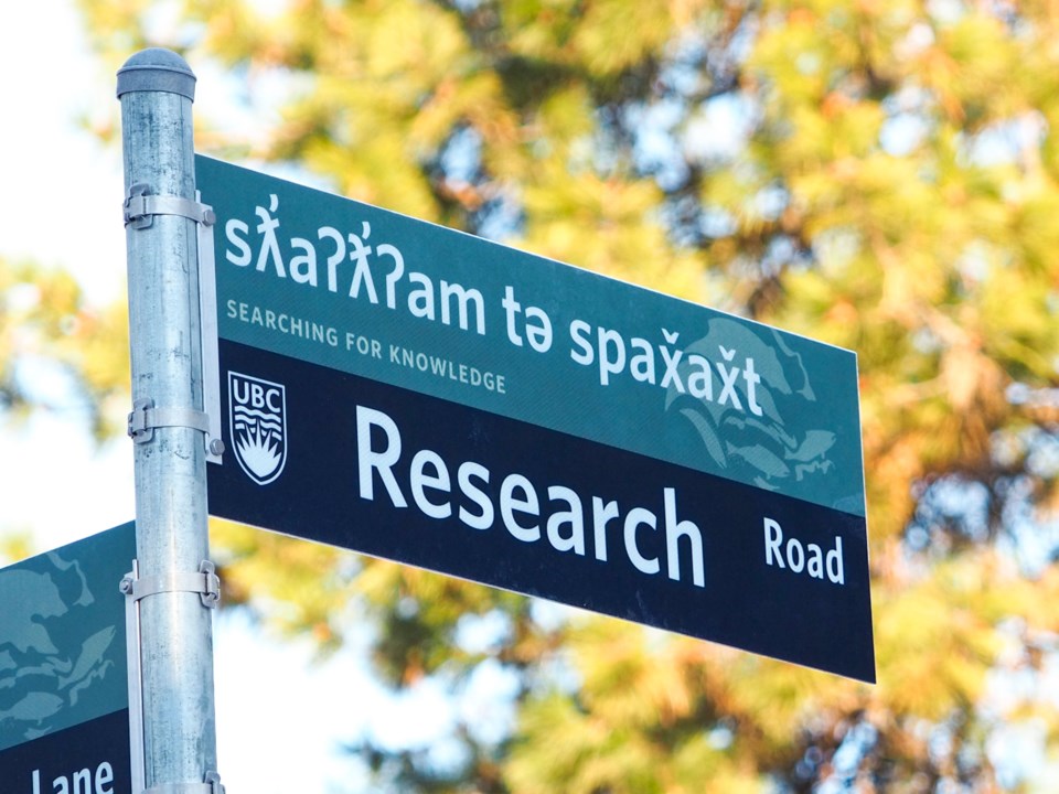
Why is font important? Whether Merriweather or Montserrat, the font used can help enhance the readability of the writing, make it easier to memorize, and, in certain cases, ensure languages and cultures are accurately represented.
For the previous four years, the latter has been driving a team from the University of British Columbia to create an entirely new font – named Whitney Salishan – that typesets Salish Indigenous languages.
Birthed by a desire to respectfully express the Musqueam language of hən̓q̓əmin̓əm̓, the font’s creation now means characters from the Musqueam language can easily be typed, rather than laboriously sourced and copy and pasted, and the lettering used on university signage and documents will fit in seamlessly with the institution’s brand.
Vanessa Campbell, a Musqueam band member and Musqueam Language and Culture Department staff member, said prior to the creation of Whitney Salishan, UBC used First Nations Unicode, a similar typeface to Times New Roman and the only widely accessible typeface that accurately represented the Musqueam language.
“As times changed and as things modernized, people moved from Times New Roman as a staple typeface to fonts like Arial. This meant that hən̓q̓əmin̓əm̓ looked different on the page, standing out everywhere it was put," she said.
The Musqueam Indian Band uses the North American Phonetic Alphabet (NAPA) as opposed to the Latin alphabet because the letters of the English alphabet do not accurately represent hən̓q̓əmin̓əm̓ sounds.
The Musqueam language contains 36 consonants, 22 of which do not appear in English. Without the correct symbols, accents, apostrophes and markings above letters, sounds aren’t conveyed as they should be, and words can lose their meaning entirely, said Campbell.
“Apostrophes, for example, represent a phonological process. Sometimes it is glottalisation, while on other consonants, it can be injection. So they’re doing very specific things on these letters.”
It was a long, four-year process to put together the font, involving hours of consultation and consistent back and forth with Campbell to ensure the typeface integrated with the UBC brand while still respecting the Musqueam language, said Matt Warburton, design manager for UBC Brand and Marketing.
“We wanted things to look correct, we didn’t want it to look like it was an afterthought.… It was really, really important for UBC to be able to speak with its voice, but in the language of the Musqueam,” he said.
The design of the new font, which is also capable of typesetting nsyilxcən, the language of Syilx Okanagan Nation, is a step forward in reconciliation with the First Nations whose ancestral and unceded territory UBC's Okanagan and Vancouver campuses are situated within, said Warburton.
“It’s a little thing, but in a lot of ways, it’s these little things we do to work with Indigenous groups across Canada that are really important," he said. "If there’s anything that we can do to assist in helping save those languages and bring those languages back to life, I think it’s incumbent on us to do that.”
For many teachers, parents, students and visitors to both the Okanagan and Vancouver campuses, the signs and documents will present the first introduction to Coast Salish language, said Campbell.
“As soon as you see a sign within UBC and it’s not written in English, you’re inherently brought to the idea that you’re in Musqueam territory without being told,” said Campbell.
“Every person that learns a symbol and hən̓q̓əmin̓əm̓ is taking small baby steps forward into reconciliation. This is meaningful for Musqueam, it’s meaningful for this department and, as an Indigenous woman, who is working hard to revitalize the language of her people, it’s meaningful to me.”
Mina Kerr-Lazenby is the North Shore News’ Indigenous and civic affairs reporter. This reporting beat is made possible by the Local Journalism Initiative.


