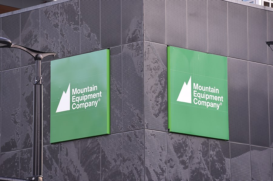
It's been roughly a year since the outdoor supply co-op MEC sold its assets to the US-based private company Kingswood Capital, and this week they announced they're bringing back an old staple - the mountains on their logo.
The storied Vancouver company went into a full tailspin in the beginning of the COVID-19 pandemic, capping off years of financial losses, and the move to go private was framed by the board as the only viable way to save the brand.
It was an immensely unpopular move for many longtime members, some of whom organized and raised $76,000 to pay for legal fees in an unsuccessful effort to petition against the sale in court.
But the company's PR problems had started nearly a decade previous when they somewhat abruptly flipped the script on their membership.
In 2013, the mountains disappeared from their logo, as did the words "MOUNTAIN EQUIPMENT CO-OP" in all caps, and what replaced them was a sterile square with the letters "MEC".
Sure, changing a logo might be slightly less contentious than, say, dissolving what was once a grassroots organization in favour of a foreign ownership structure, but this was when the members were exposed to the fact that they were starting to act like a private company, not a community owned- co-op. The new logo was part of their plan to expand beyond their core and appeal to a more "urban" clientele, to take up a larger market share.
In a 2013 release, the company outlined the move, stating that "While backcountry activities remain the largest part of MEC's retail offering by a significant margin, the strongest growth has come from urban activities such as cycling and running."
To be frank, it was a stupid idea to take the mountains (and their very spirit) out of the outdoors brand, and to realign its focus.
Fast forward to this week when it was announced that they're hoping to revive the spirit of the business and, yes, the mountains are back. Check out this brief look at the history of their visual identity:

In a statement, MEC says that the new (old) logo "honours its rich history," and that "the peaks represent the future of the company and its commitment to core values: providing the best technical gear, offering expert advice and helping to build outdoor communities.".
The logo was part of an overall rebrand, and what they're framing as a commitment to both the community and sustainable business practices.
Judging by some of the the responses they get on Twitter they're going to be pushing a rock up a mountain for some time, but it is certainly nice to see the brand return to its roots a little bit.
Their challenge as a business will be to weather the storm of disgruntled former members, winning some of them back, and making new ones. We'll see how the transition from "Co-op" to "Company" goes in the coming years.


