|
THE OPENING is all about introducing the fascinating, quirky and wonderful people working in and around the visual arts in Vancouver. Each week, we'll feature an artist, collective, curator or administrator to delve deep into who and what makes art happen! |
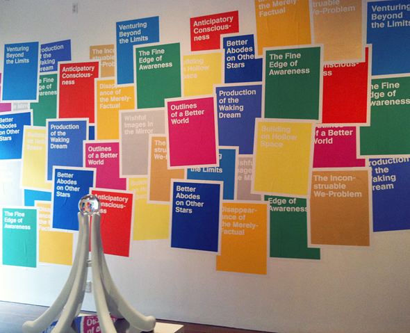
'Persistance of Vision' at Artspeak (Photo by Anne Cottingham)
Holly Ward (b. 1973) is an interdisciplinary artist examining ideas of utopia and social progress. We sat down over tea to discuss her most recent works and ideas.
You talk a lot about utopia and social progress - do you see one leading to the other? What interests you about these ideas?
Both of those are kind of problematic phrases or turns to throw around. I guess what I’m really interested in is how through formal strategies people can try to represent how to re-organize society towards something better. So there’s always some kind of idea around the something better. We can always articulate what’s lacking or what’s better in contemporary culture, but how do we try to articulate exactly what that is and where we want things to go? I’m really interested in the aesthetic strategies around that and how can aesthetic strategies translate into building something social. I don’t think visual art is necessarily something that can create social change or social movement. But I’m interested in the relationship between aesthetics and these things that kind of grow for different means. Say for example, the show that’s at Artspeak right now is thinking a lot about the Arab Spring. That’s all the kind of rolling revolutions that are happening through Greece and Spain and Tunisia and Egypt and Libya and how these ideas are catching on in terms of people wanting something better and wanting something different and how they go about creating that something different. I’m just really interested in the aesthetic questions that come up around that, and engaging with it, not necessarily creating it but engaging with it through visual art.
Speaking of your Artspeak show, in the writing for 'Persistance of Vision,' it notes that "this exhibition creates a linkage between contemporary spaces of protest and historical representations of the 'utopian' city square." Is the utopian city square a place of protest? Or is it a place of dialogue and peaceful progress?
I think the ideal, which is utopia, it’s peaceful. It is not necessarily something that is loaded with contentious issues, which is why it always remains hypothetical in real life and the real world where there always are contentious issues and that’s just the reality. But this idea of the fictional better place is really interesting in terms of, what are the different ways that people have tried to represent that, what are the different criteria that might make that up. So I was really just playing with visual strategies that try to describe that. Often geometry, a kind of balanced, harmonious geometric layout for the city is something that is seen as being conducive to creating this ideal space. That’s where the diagram on the floor came from, this sort of diagram for an ideal city. And it made me think a lot about centres of cities verses pockets of communities on the outskirts and ways to kind of travel through that space and connect these kind of disjointed spaces. I think that’s kind of where I was riffing off of that kind of geometric interpretation of a city space.
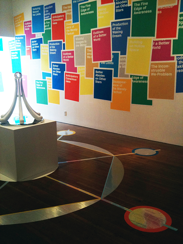
'Persistance of Vision' at Artspeak (Photo by Anne Cottingham)
Was it intentional the space reflect in the ball?
I did want to leave a lot of blank space in the gallery just to create this open, openness. The wall with the posters is kind of chaotic and colourful and everything is kind of fighting for dominance over each other and some of the text is overlayed with other text and things like that. So there’s kind of a dynamic energy happening with those posters. I didn’t want to have too much competing stuff in the gallery. I wanted everything to kind of be harmoniously linked, also thinking of the harmony of the ideal city or the ideal space. So I wanted to leave what would normally be the main walls for exhibiting work in that gallery very blank. I’m interested in airyness and openness.
Where did the phrases on the posters come from?
Those are a compilation of different phrases from different utopian philosophical texts. I didn’t make them up – they were from my reading and research. I ended up choosing a lot of phrases from this writer called Ernst Bloch. He wrote a 3 volume series called ‘The Principle of Hope.’ It’s a very large, very dense philosophical tract on the nature of utopian thinking. What are the tools that we need to picture these other spaces and why would we want to do that? A lot of the phrases are taken from names from essays or chapter headings in this 3-volume tract. I just kind of liked his poetic turns of phrase and I thought they were fanciful enough for someone to be able to take them and make their own meaning from them. I was really interested in that, you deciding what a better abode on another star might be. Not trying to describe that for you but just kind of throwing that out there as something to turn over in your mind.
They reminded me of sci-fi novels.
There’s a big connection between utopian literature and sci-fi, and I actually came to my thinking about utopia through my interest in sci-fi. Which is why a lot of the work ends up having this sci-fi feeling or flavour.
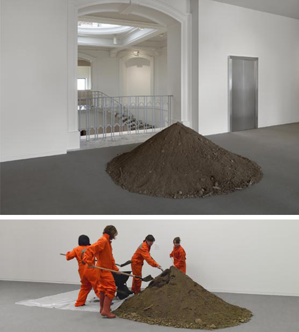
"Island" in 'How Soon is Now' at the VAG
"Island" in 'How Soon is Now' at the Vancouver Art Gallery involved a group of staff and volunteers moving a pile of soil to different locations in the gallery every week. How did you feel the work existed in relation to other works in the show, considering it was among so many different pieces during the run of the exhibit?
I was really having fun with this idea of that piece encroaching on the territory of other pieces in the show. That was the second time I had actually shown that piece – it was shown first at a small commercial gallery in Toronto in a group show. The loose theme of this group show was utopia, and I was kind of scratching my head about representing utopia in a commercial gallery. When a show gets put together each work has it’s own territory that it is supposed to occupy, and nothing is supposed to transgress that boundary. Once the show is set, everything has their space, and nothing should really encroach on that. I just wanted to completely encroach on that! Just have it be a different experience if someone were to go back and see the show more than once. That piece for me is about the process of continuous negotiation and re-negotiation. When it was at the VAG, the volunteers decided where it was going to go next. It wasn’t my choice. Which I thought was really great, and made it really fun for the people who did it. I was not interested in creating this scenario of alienated labour, but engagement and discussion. The parameters were still set.
I’m sure there were places they weren’t allowed to put it.
Yeah there were lots of places. They couldn’t spread it out in a very thin layer all across the gallery, or they couldn’t put water in it and plant something. I think for the people who were volunteering it was kind of interesting to decide where they were going to put it and how close. I did designate one place where I wanted it to go. I had wanted it in this Abstraction show that was happening at the same time, very clean, very precise. And that almost happened but then it didn’t quite happen. So I also put it up in the Emily Carr room which I thought was pretty.
You were invited to participate in "An Invitation to an Infiltration" at the Contemporary Art Gallery in February 2010, a VANOC/Cultural Olympiad sponsored exhibit. How did you feel about being asked to participate?
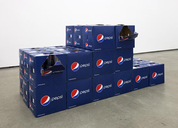
"Operation Podium" in 'An Invitation to an Infiltration' at the CAG
I was very conflicted. I wasn’t sure that I was going to. I had been asked years ago, because we prepared for the Olympics for seven years. I had been asked years and years and years ago to do something that was receiving the Cultural Olympiad funding, and I didn’t want to do it. I didn’t want to be associated with it because I voted against the Olympics in the plebiscite. So for this exhibition the Olympics were coming and everyone was ending up doing something for the Olympics. It was kind of like this vortex that was sucking everyone in. There were a lot of enticements and there were a lot a good opportunities as well, which is totally fine. But for this exhibition I was really not sure that I wanted to participate at all. But when I started thinking about it, it was curated by a curator from the States, Erik Frederickson, who is great, but not someone who is totally up on the local ins and outs of this kind of moment happening. And a lot of the artists… Jonathan Middleton was the only other artist invited to participate who was based in Vancouver at the moment. So I felt like there was this possibility of the exhibition having nothing to do with the context of the Olympics other than in a very superficial way, to my thinking as someone who had been following it for seven years of discourse and debate. I thought me doing something for the show might have more impact than me attending a rally. So I just decided to be present in that gallery, and to see how I could address what was going on at that moment. I felt conflicted about it all the way through.
The Pavilion, your year-long artist in residence project at Langara College, saw a number of collaborative projects and programming. Do you feel engagement with the artistic community is an important gesture in your work?
Yeah of course. Maybe in other places it’s different. But here, our audience is mostly other artists or other creators or people who are seeking it out. It’s not part of the mainstream at all. Just thinking about who we are speaking to and who speaks back to us. I wanted to create a space that would generate ideas. You provide some kind of framework, and it had formal resonance. I was interested in what connections that form itself might have created in a contemporary setting. That was where it became really important for me to solicit ideas and input, and to make things open and enough room for that to happen. I didn’t want to create all the content, I wanted it to be a meter of where the ideas around that kind of form might sit, and where they could go beyond what I could think that they could do.
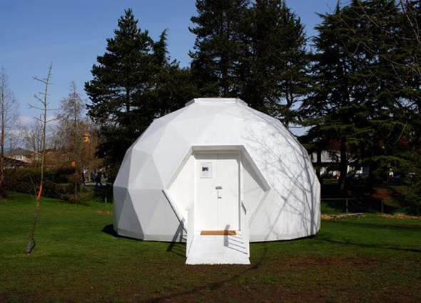
The Pavilion
How was your experience creating the pavilion and being an artist-in-residence at Langara?
It was really good. It was really intense, I don’t think I’ve ever worked so hard in my life. I feel like it really challenged me, because I do work as a solo artist, and I didn’t actually really collaborate with anyone. I kind of set a scenario where people could contribute to something that I had already set up. So it was kind of a controlled collaboration if you could call it that. I became a facilitator as well – doing a bit of curating, but allowing myself room to set up or break any rules that I wanted to around that. I learned a whole bunch of skills that I never had before. I’d never made a free-standing architectural space. I was really interested in the idea of skilling up. It just expanded everything in a really big way for me. I don’t know if I can really encompass everything I got from it.
In terms of the structure itself, I knew it was going to be a temporary structure, but I didn’t want it to end up being something that was wasted in the end. So we built it in such a manner that it could be taken apart and re-used. And I didn’t know at the time what that would be or how that would happen, but I just wanted it as an option at the end. It’s turned out now that we’ve been given a piece of land in the Interior to put it on. So I’m going to lay the foundation and build it permanently. It’s this whole other aspect that I wouldn’t have originally been able to imagine doing but totally dreamed of doing. Now it has a permanent home, and I’m still really open to thinking of it as an art space and as a generator of ideas and input. I’m really interested in people continuing to contribute to that, but it’s long term.
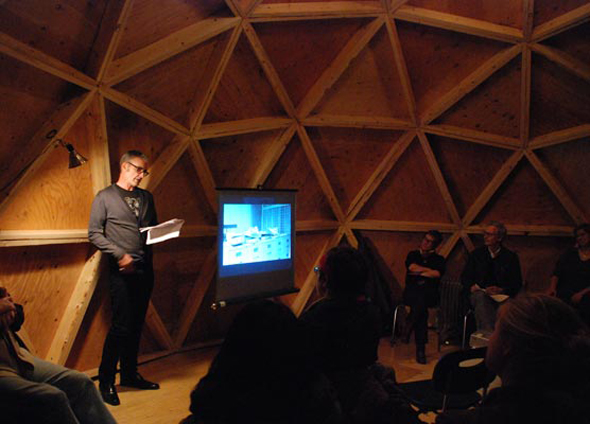
Clint Burnham doing a reading at The Pavilion
Will you be facilitating it, or will a local group be doing it?
It’s just my thing, I have no funding, I have no support, I have no bureaucratic framework, which is good and bad! Things will take place over the long term, and it will be quite a holistic experience but also something that will kind of feed back into my own creative processes. The things that will come out of that might be very different from the things that I can imagine here.
What led to your installation at the CBC plaza?
Someone asked me! That was a bit of a windfall. Some of the people who were involved in the Pavilion project administratively were also involved with this, so I was approached to do it.
How did you go about deciding what you were going to put on that big giant wall?
It's huge, right? Massive. And I don't really make 2-dimensional work very often. So for me to make an image that's 45 feet by 32 feet or something? It's kind of crazy. I had first heard about doing the project while I was in Banff. For a month I was somewhere else and couldn't really figure it out or think about it. I just had to come back here, and spent at least a month in the CBC Archive and the City archive because there was an impetus to do something based on the archive for that project. In the end I didn't find anything that I really felt I needed to use or kind of addressed the context of that space. I didn't want to just plop something in there. You could put any giant image there. I wanted to really think about what was the function of that location, and how would an image work in that location. So I started thinking about agitation-al propaganda from the Russian Constructivist era, and this is tied into my interest in visionary architecture as well. So there's this whole kind of genre of architectural drawings that described these platforms that were to be built in public spaces that had information coming from them. Like scrolling information panels or screens or radio broadcast towers or platforms where people could go up and do speeches with a loudspeaker and things like that. So these agitational propaganda constructions were basically architectural visions about how these structures can create a common sentiment in people. The CBC building, that whole square has coffee shops, a little green space, a big tv screen, there is scrolling LED with news headlines, there are all these satellites on the top of the building. So all this information is coming into the CBC building, being generated in the building and then being put back out. It just really struck a chord with what these agit prop designs were meant to do, but could never actually get there because they didn't have the materials or the technical capacity at that time. But there were these really interesting drawings and proposals for things we are seeing right now, even though the political and social climate is kind of different. Somehow these ideas have been held on to, regenerated and made real in our time. So I was really interested in making this connection to what was going on in that location with it being public space and all this information being generated, shared and how that information that is going out in that space still does create a public.
I think those are all the questions I have, so thank you!
Yeah, thank you!
-----
Holly Ward lives and works in Vancouver. She obtained her BFA at Nova Scotia College of Art and Design in 1999 and her MFA at Guelph University in 2006. Her work has been exhibited at the Belkin Gallery, Vancouver; Or Gallery, Vancouver; Republic Gallery, Vancouver; YYZ Gallery, Toronto; Art & Idea, Mexico City; VTO Gallery, London UK; and Insa Art Space, Seoul, amongst others. Currently, her work can be viewed at Artspeak until July 23, and at the CBC Plaza. She will be giving a talk related to her Artspeak exhibition on Saturday, June 25 at 2pm at Artspeak, 233 Carrall Street. For more information on her work, please visit her website at hollyward.org.
All images courtesy Holly Ward, unless otherwise noted.


