Artist Kevin Lanthier opened an exhibition at Hot Art Wet City just over a week ago, it has received much attention. This is because the subject of the artist's project is top of mind for many individuals living and working in this city. The Special covers the spectrum of issues that many Vancouverites are critical of and interested in – all of which are connected to the city's growth. The speed of development, affordability of housing and the rapidly changing architecture of the city are a few of the key subjects that the work traverses.
Visually, Lanthier's meticulous photo-montaged series delineates forced perspective streets where groupings of residential or commercial architecture are plotted out sequentially.The entrance of each structure faces the viewer. Each series is categorized, inspired by ideas founded in both fact and fiction. With a strong linearity to them, the imagery would work splendidly as a pop-up book, or as an exquisite set of accordion booklets.
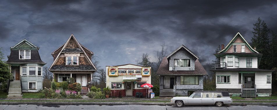 East Van Relics, 40 x 100 inches, chromogenic print, edition of 5
Lanthier created interesting stories by connecting different houses types and styles of architecture together. The series, in many ways, acts as a lexicon for distinct 'Vancouverisms' in architecture. The artist also explores these subjects thematically and symbolically, adding in environmental and ambient tropes to further expand the narrative of each composition. For example, his Storybook West Side series features fairytale like homesteads strategically placed in front of a green forest, it also includes a colourful sunset behind the forest that extends into the realm of magical realism.
Vancouver Is Awesome caught up with Kevin Lanthier to ask him a few questions about this exhibition and his work.
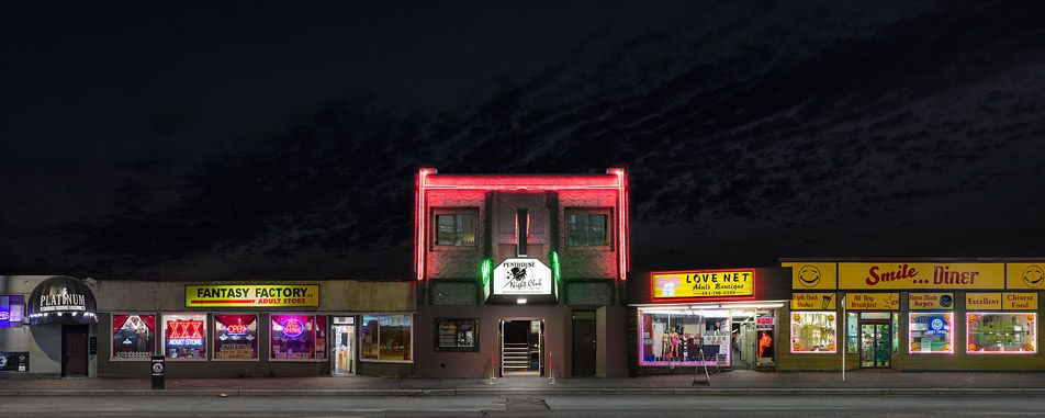 The Old Entertainment District, 40 x 100 inches, chromogenic print, edition of 5
This exhibition is formulated with the context of cataloging or indexing just as much as it is about myth-making and storytelling. Are you interested in systems of categorization? If yes, does this come up frequently within your work?
Although I hadn’t exactly intended to catalogue Vancouver housing styles, I do understand that there’s an inherent aspect of the delineating and organizing of Vancouver houses within the series. I think in this case it’s more a byproduct of my method of distilling the city into strongly thematic scenes to emphasize how we conceptualize it, rather than a hallmark of my work as a whole.
The writing about each montage series that accompanies this exhibition seems to reflect an observational perspective that is somewhat rose tinted. It is clear that you have thought a great deal about the context of each of these spaces within the collective history of Vancouver. You have also carefully considered the odd juxtaposition of neighbourhoods, buildings, class structures and demographics of this city. I am sure that there has also been a significant amount of research involved. How long have you been working on this project?
It feels, in some ways biographical and in others also quite personal.
Do you see it as one or the other? or both?
If yes, please explain?
I’ve been working on the series for about three years. I suppose I see it as a critical biography of the city, however upbeat in tone, but of course the questions I raise come from my own personal experiences and viewpoint. I think all biographies and documentaries carry the biases of their authors, just as history is written by the victors and even theoretical physics experiments are actually affected by the mere act of observation. Whether it was renting a basement suite or eventually purchasing a condo, my own relationship to real estate in the city was certainly an influence, to give one example.
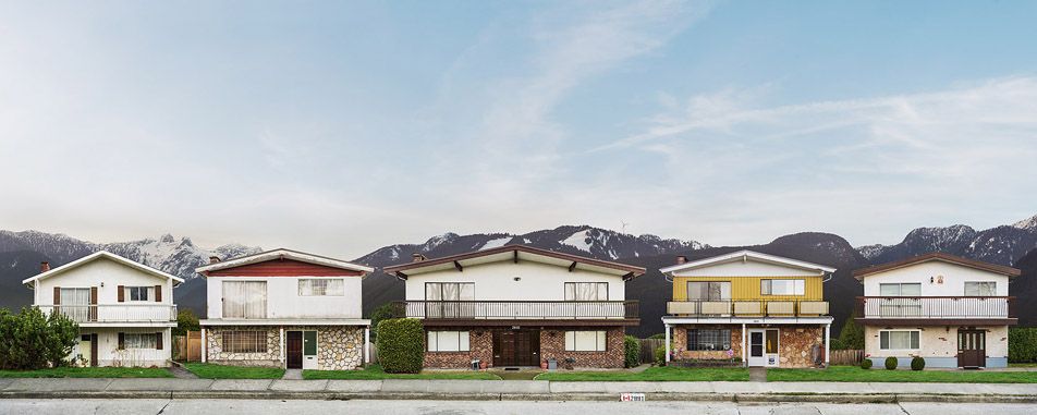 Vancouver Specials, 40 x 100 inches, chromogenic print, edition of 5
The Cult of the Vancouver Special.
VIA: There are several artists who have referenced or completed projects on Vancouver Specials. Keith Higgin's "How To Look At A Vancouver Special" publication in 2010 and Ken Lum's "Vancouver Especially" installation in 2015 that comments on the extremes of Vancouver's economic stratospheres come to mind. The Special has become iconic, it has been used to name a local music compilation album and also title a book featuring stories about Vancouver. Are aspects of your exhibition that transcends the collective history of the special, and take it in a new direction?
The Vancouver Specials themselves were for me more of an entry point, as they already have so much cultural awareness surrounding them, as you point out. I’m not sure what I could say about them in and of themselves that hasn’t already been said by others, and likely better than I could, but I do find it interesting how our feelings and reactions to them compares to other housing styles in the city, starting with what I’ve been calling the “New Vancouver Specials”, which seem to elicit almost no reaction. Why was the original design so hated that bylaws prevented their further construction, but what ultimately replaced them was essentially the same but with a new surface aesthetic? They also don’t have basements, they also feature separate, ground level suites, they’re also clearly designed to fit the city lot footprint and building codes to maximize interior space, and finally, they’re no less pervasive. Driving on any East Van street, you’ll see them everywhere if you look for them. I don’t know the current number of houses in the city with that design, but at one point will there be enough of them and will they be unfashionable enough that they will spark similar awareness and scorn? Will they then, some years later, elicit the same nostalgia? Perhaps it’s all cyclical, and time will tell, but a process of tearing down and rebuilding houses for reasons of fashion seems like a poor expenditure of resources, not to mention a hugely unnecessary creation of waste.
The difference I do see in them, however, is in their purpose. Based on my own experiences looking for a place to live, it seems that with these newer houses the purpose of the layout with the separate suites is that they can be rented for needed monthly income to pay the mortgage for these now million dollar houses, as opposed to the original Vancouver Specials, where the suites were more often utilized for multigenerational families to stay together. Being a coping strategy for a ridiculous and unfortunate market situation just doesn’t elicit the same emotional response as being an affordable solution for incoming families. Beyond the comparison of old and new Specials, though, the design of any group of houses affects how we feel about our neighbourhoods, be it the Victorian houses of Strathcona or the Storybook houses on the west side, they’re all “specials” in their own, seemingly much less heralded, way. Hopefully the exhibition transcends the Special by being about a lot more than solely that type of house.
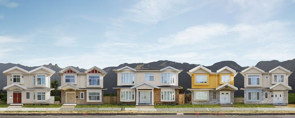 New Vancouver Specials, 40 x 100 inches, chromogenic print, edition of 5
The notion of 'special' is connected to many ideas within this body of work. It is the namesake of the original architectural development and also, the term, when connected to construction, can simultaneously suggest superfluousness and practicality. Over the past 8-10 years, architects have either embraced opportunities to renovate these spaces, or torn them down, as they were deemed to horrendous to update. These homes evoke nostalgia, appreciation and also disgust. Vancouverites seem to enjoy polarizing The Special. Where would you say you fit on this 'special spectrum'?
I think it’s kind of interesting how there’s a cycle of ironic nostalgia that grows into genuine nostalgia, just as the term was originally derisive in nature and now we have a store on Main Street called Vancouver Special and “taking it back”, so to speak. My view has evolved along those lines with my research of them. Like most people with most things, I was quick to judge them. When you first come to take notice of the house style, what first occurs is that their age and material finish (the stucco and stone veneers) seems outdated and unfashionable, and then of course their cookie-cutter nature makes them undesirable to a degree in and of itself as well. But they are unique to and iconic of our city, so at first I think I shifted to liking them on that somewhat tribal level of “okay, they may be ugly cookie cutter houses, but they’re OUR ugly cookie cutter houses!”
But as soon as you look beyond the superficial, and start to consider the value of their design, in terms of how efficiently they use space, and their history, in how they provided such practical and effective housing for so many people, especially new Canadians, you grow to honestly appreciate them and their legacy. How many people who are making significant contributions of our society today grew up in one of these? To what degree did they allow families, especially multigenerational ones, to afford functional, comfortable houses?
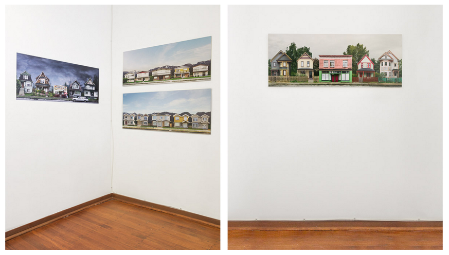 Installation View of The Special
You mentioned that Vancouver is a city has many cliches and myths.
Are there other old chestnuts that you hope to crack open and explore in future projects?
Yeah, there are a lot of stories in the history of migration around the city that can be seen in our architecture, I’ve really only scratched the surface. I’m also considering how including other visual elements, like perhaps people and wildlife can add to how the stories are told.
To end on a poetic note, can you name three types of emotions you hope visitors will experience when visiting The Special?
If I had to pick and choose, I’d say joy, wonder, and thoughtfulness, in that order. But, if it’s more like annoyance, incredulity, and disdain, I’m good with that too. I’m thankful for any and all emotions people feel in response to the series, it’s all you hope for when you set out to create anything, I think.
Pennylane Shen curated the exhibition at Hot Art Wet City, she shared her thoughts on the work with VIA earlier last week.
Kevin and I worked closely together on this body of work so I was able to see it fully develop over the past couple years. Fortuitously, the completion of The Special has coincided with some hugely topical issues regarding the price of housing, emigration and the cost of living in Vancouver. I felt the fabricated and fictional element of these crafted yet distinct neighbourhoods spoke to these anxieties and the nostalgia we associate with a city that is rapidly changing, perhaps at a rate it cannot keep up with. I chose the gallery Hot Art Wet City, because it is also very distinctly Vancouver, its audience of a generation that has grown up in a city where they cannot now afford housing. Gallery owner Chris Bentzen and I are both examples of this and working in the arts especially, this body of work resonates deeply with us.
The Special is up at Hot Art Wet City until January 30th.
Hot Art Wet City is open Wednesday – Saturday from 12noon-5pm.
Kevin Lanthier: kevinlanthier.com
The Special: hotartwetcity.com/current/
An interview with Lanthier: https://www.youtube.com/watch?v=1SXOh12J4_0
Hot Art Wet City: hotartwetcity.com/ - 2206 Main Street, Vancouver BC Canada, V5T 3C7 / 604-764-2266


