
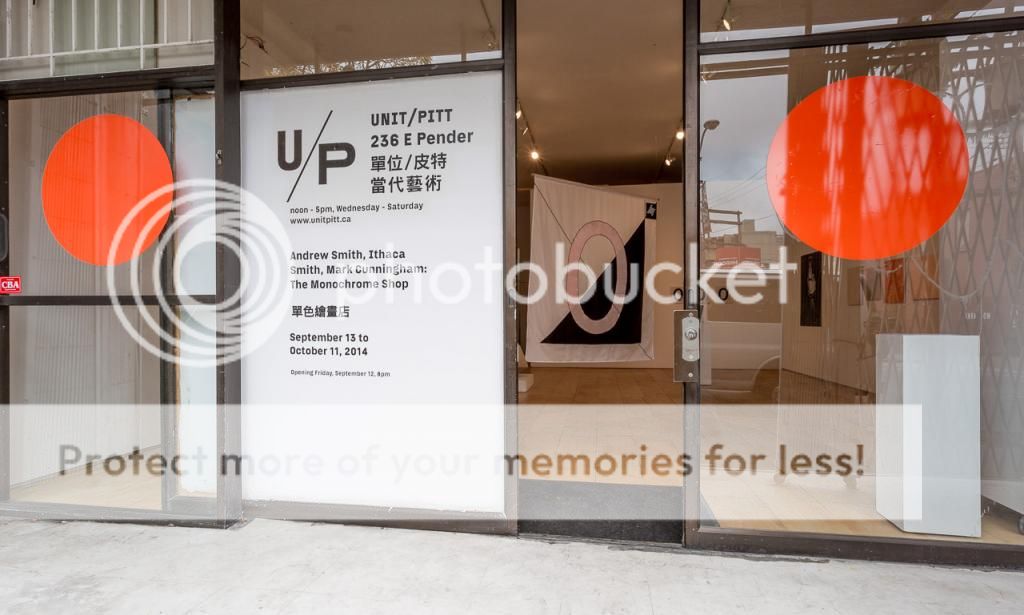
MONOCHROME SHOP - Andrew Smith, Ithica Smith and Mark Cunningham
UNIT/PITT Projects
September 12 - October 11
The best art commercial out there, that's what you'll discover if you visit Monochrome Shop at UNIT/PITT Projects in Chinatown. A power-packed advert finished in crisp black and white text. The announcer shouts at you to reveal every single type of monochrome that you can possibly purchase at the shop. From zombie formalist monochromes to decorator friendly brand-name reductivism, everything must go! The availability and variety of monochromes at Monochrome Shop is...well, astonishing!
Artists Andrew Smith, Ithica Smith and Mark Cunningham have created a tongue-in-cheek shop that challenges the traditional role of the artist run centre. They've re-appropriated a former grocery shop turned artist space. Turning it again back into a commercial shop. One that sells the most 'saleable' type of artwork on the market. That's right folks, the Monochrome! Come and get yours while supplies last!
 Photograph by Blaine Campbell
Comparing the popularity of the monochrome with the contagiousness of a virus, the artists channel Kasimir Malevich and reveal the Monochrome as a grounding force in art, life, and in the process of collaboration. The Opening stopped in to chat with Andrew Smith and Mark Cunningham about the project and discover just how adaptable and versatile the monochrome is. For a full reveal on our findings read the interview below.
If you want to discuss the exhibition with the artists, you will have a chance to, artist Mark Cunningham is making work in the shop throughout the exhibition. There will also be a book launch towards the end of the exhibition visit UNIT/PITT Projects to find out more.
 Photograph by Blaine Campbell
VIA: How did the idea come about for the project?
MC: It was from having a conversation... ultimately.
AS: This started a year ago, maybe even more than a year ago. Anyways, it was just a lot of conversations. At the bar, where all ideas are spawned. You know, I don't know how we came to Monochromes.
MC: It's the idea that... I think it made sense as an idea that related to the practices of the people that were involved. Initially, I think, everyone involved had some interest in the monochrome. We all like making them, they're easy.
AS: I think that was an element of it to, because from the beginning, or maybe once we decided that monochrome was something to use as a vehicle for the show that was about economy. It's also about the efficiency of making them in some ways. Which is not actually true, because often they can be very difficult to produce. But, the idea of the monochrome can be this gesture that is very simple but because it has so much history behind it, it has a high value. So you know, the ratio between work and value is in our favour, but, obviously, we strive to be a little bit critical of that.
VIA: The notion of the monochrome stretches across history, across mediums, genres and styles.
AS: Definitely, Mark went really far back with Monochromes, what are the works that have the subtitles to them?
MC: The jokes?
AS: Yeah
MC: Les Incoherents were a group of 19th century proto-dada artists who put out magazines and stuff. They did a series of monochromes which were these rectangle shaped monochromes with a frame around them and each one had a text with it. The black one which was titled "Combat de nègres dans un tunnel." They were all just these ridiculous titles about these works, which were these crude jokes about the colour of each rectangle. There was a visual element which was the monochrome. It is a good analogy to the monochrome in that the monochrome itself is dumb or mute, it's only once someone says or writes something about it, then that becomes what it is about.
AS: one other thing, thinking about the origin of this show and using the monochrome, for us because we've fluctuated from being a collective to 2 people to back to a collective, it's been a long road to get here, it kept us focused, keeping the monochrome as our solid rock. Monochrome was our rock so we could kinda stay grounded because it's been a long time coming, with such a different group of people that aren't here.
 Photograph by Blaine Campbell
VIA: In terms of the others who collaborated in the project, was distance a component to collaborating?
AS: Yes, because I live in Portland Oregon, we're collaborating with a fellow who lives in Berlin and a woman who lives in Australia. We were setting up Skype meetings whenever we could and it was a very kind of tedious communication, which is facilitated so easily now by things like Google Chat.
MC: Time zones were a huge challenge, finding time zones for everyone to talk in the same space and time. It felt like it was slowed, the discussions, moving things forward, the discussion was slowed down by that.
VIA: Can we discuss some of the pieces in the show? The text written up for the show, presented as an artwork is interesting, can you tell us more about that? The element of the monochrome spreading like a virus is interesting.
MC: Well I guess... the text is about the text, you should read it. That is what the text is about. Ha ha. Again, it was a type of language that adhered to the monochrome. Historically, this idea of contagion had be come a way that various iterations of the monochrome were talked about. Malevich, his ways of understanding his iconography was to a significant extent related to bacteriological. Bacteriological lines, he saw it as an infection slash cure, like a homeopathic agent.
AS: Yeah, and then to go back to the space, a lot of time when you have writing it is on a table or plinth, and this is forcing that piece of writing into being part of the identity as a piece within the show. It is a monochromatic trope and becomes what it has to be.
VIA: There are multiple iterations of the text printed behind the top essay?
MC: Yes, and the text is free
AS: They're free, the one free thing in the show.
MC: Because you know writing is cheap. (Laughter)
 Photograph by Blaine Campbell
VIA: Going further into that idea of infection, and the monochrome spreading. Having encountered other artists and designers who work solely with monochrome, often it ties into their personal identity as well in terms of them adopting monochromatic dress habits and becomes a mantra and focus for not only their practice but also their identity. I've also met collectors of art who also work exclusively within certain colour pallets, greys and blacks for example. The monochrome is infectious, and again this ties into the commercial element of monochromes being a popular type of artwork.
MC: Yes, they sell, which helps to spread...
AS: They sell, and they're pre-subscribed to a set of rules so if someone only wants to buy black and white pieces, we've set an ideal situation up for them to come and take a look. But, not just that, I think when you have, like for example going back to the designer... when you make those kind of decisions in your life it is something that defines your individuality. People like to have qualities, like it's important to have your own qualities, and it give them value, it gives your qualities value if you can adhere to them.
VIA: Again, we are going back to this concept of the monochrome as a grounding element. In this case grounding one's identity in the monochrome. A concept that can ground an artist or an identity.
MC: It's [the monochrome] indifferent to how it is viewed, and it looks very good! It looks good, but it doesn't really care whether you think that or not. ha ha...
VIA: There is another exhibition that is going on in Vancouver right now which is called Monochrome. It's at Marion Scott Gallery / Kardosh Projects Gallery, It is interesting given the timing of it coinciding with this exhibition. The show wasn't in the same context of a collaboration, it is more a group exhibition of works that have been selected based on the monochrome theme.
MC: Obviously we haven't done our homework because we haven't heard of it, or maybe they haven't done theirs. (laughs)
MC & AS: We should go take a look.
VIA: For sure.
 Photograph by Blaine Campbell
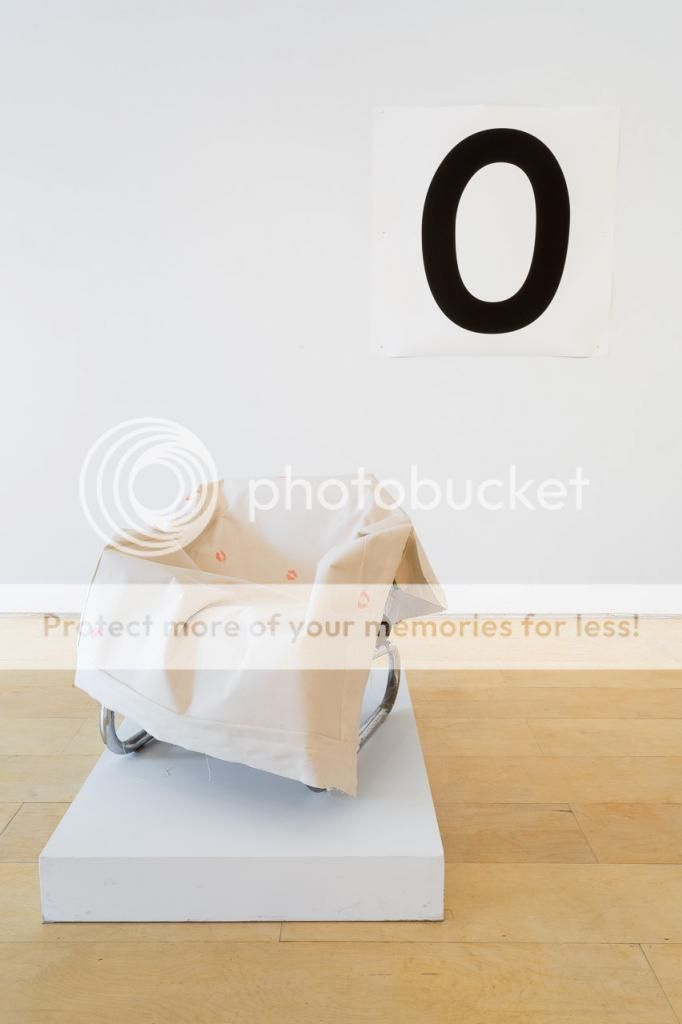
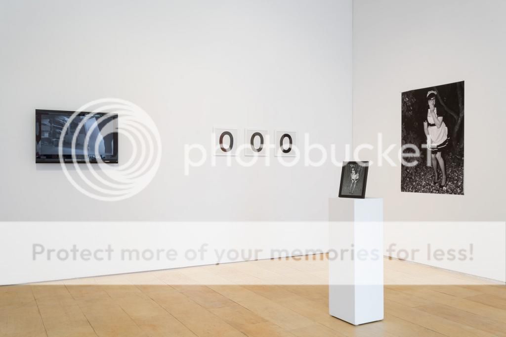
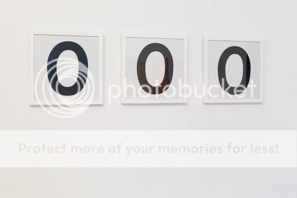
VIA: There are other text based pieces in the show, in particular there are a set of three framed black zeros on white backgrounds over here, can you tell us more about these? Is there a reference to the digital there?
MC: Not intentionally that I am aware of. Actually, they're 'Comic Sans' zeros. So... that's really what they're about. Literally translated 'funny without'. They're lacking.
AS: The thing I like about them is that they're sneaky in a way, because a lot of people don't know that they're Comic Sans and it's a very different kind of thing to identify so they have this kind of silent identity that is actually extremely strong because when you find out that its Comic Sans its a huge part of...
MC: It's a huge let down... It's like, I hate that now.
AS: Well not just that, but also, that's, that's only Comic Sans. There is no other zero that is like that, that's a typeface that has been solidified over time and by use there's no other Comic Sans zero, you know, like that's it. It's funny, that's why I like that piece a lot because together the three of them together they all kind of look a little bit different in that formation, they're hard to kind of pin down.
VIA: Yes, the black almost seems like it is moving.
MC: It's the shape, because they're not symmetrical... it's like a slightly off shape.
AS: But because it's a typeset, But the problem is that they're also so static, bye move, but they have a weird kind of buzz to them and I think that's a nice thing. And to use something so dumb as Comic Sans it comes back to the work versus value kind of thing. It's something made out of something so... like, on the bottom of all of our minds. Like Comic Sans is like the worst font.
MC: I mean it's interesting, that it...
AS: becomes so beautiful.
MC: Part of my thinking behind it is as a segment of value,
VIA: Like triple zero dollars.
MC: yes, like a declaration of its own value, and that it's so stupid.
VIA: Also moving the piece into a print realm, with the notion of editions, and proofs and originals, it kind of serves to collapse in on itself, as any printed edition of comic sans is identical to other printed editions. It can be easily reproduced.
AS: The value of them is strange because it's like this trope is spread through a few different pieces in the show, and actually Mark will be making some hand made versions of Comic Sans Zeros as the exhibition goes on in the back table with a stencil template and charcoal. So, you know it is being stressed, I like the fact that Mark took this thing and is pushing it really far with different types of presentation and also with different types of work, having this made and then compared to photo-prints and then relating the type face to a printing press and then there is a hand drawn set over there. It's like taking a quarter and getting as much as you possibly can out of it. It's a testament, it's a process piece that, who knows where it will end or how far you can spread that idea... forever.
 Photograph by Blaine Campbell
VIA: With it being a typeface, you could really push it into infinity. There are a couple video components to the show, I am really mesmerized by the sultry slow dancing with a painting in this monochrome video over here, what's going on there?
AS: The film is an attempt at exploring the traditional way of making a painting and the labour of love of creating a piece and being in love with your work. Painters are so romantic you know. They always have this history of you know, this is my baby, this is something I create and fight with for however long it takes to make it. Which I as a painter have a really tough time buying into that idea because a lot of paintings that I make are really mechanically produced. But to actually try to fall in love with the work in a physical way, it was a challenge for me to try to make that happen. And so to do that I employed this song, which is a song that is very high on my important song list. My 'top ten' of songs. It is Miles Davis' Blue Green from Kind of Blue, and I found the song only like two years ago but, it's just one of those songs that hits me really deep down, I don't know what it is about it. This album is considered one of the greatest albums of all time, but this song is very overlooked. It's like a place holder between four great hits. It's this very polite, but very emotional song in the middle of the album. It's a love song, it is sad. I was trying to channel that song, but ultimately, it's somewhat funny. The idea of dancing with a painting is a funny thing, but I think the presentation is something that becomes meaningful.
 Photograph by Blaine Campbell
VIA: The movement of the painting is really interesting, paintings tend to be static placed objects other than the visual effect that they can give. This gives it a beautiful flow and movement.
MC: I think my favourite part about it is the contact between the surface of the painting and the body of the dancer. Connecting painting to the surface of the body. They press up against each other. And also that fact that this is a love song, there is a very real kind of intimacy. Like the fact that you can see the body press into the canvas. I really enjoy this work.
AS: To go back to painting really quick, monochromes, it takes a lot of investment as a painter to produce monochromes as a conceptual way of working, you know. You're not, it's not an image based thing, I don't know how to explain it. There is something about monochromes where the stakes are very high when you're making it, especially if it is just a colour field kind of painting. It's so easy, but the rate of failure is very high. People who are very sucessfull at Monochromatic paintings take a lot of risk.
MC: really you think so, even in this market?
AS: All the really well known painters who work in monochromes, like Mark Rothko. Those are pretty serious paintings. The stakes are pretty high.
MC: I think the stakes were very high, but now I don't know if you can say that about monochrome because everyone makes monochromes. Quite likely because they sell like hotcakes.
AS: so maybe then, there's even more reason for us to fall in love with them, because they're not going away. But they do deserve our respect. But then again, obviously, we've made many monochromes that aren't colourfield paintings.
MC: Yeah, we've been stretchy with the definition of what constitutes a monochrome.
VIA: But the monochrome has an elasticity to it. A lot of people assume black and white, but it is not always this.
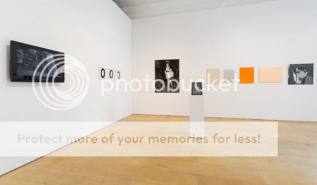
MC: yeah, also it doesn't mean that there has to be a lack of figuration either, the photography is all monochromatic.
 Photograph by Blaine Campbell
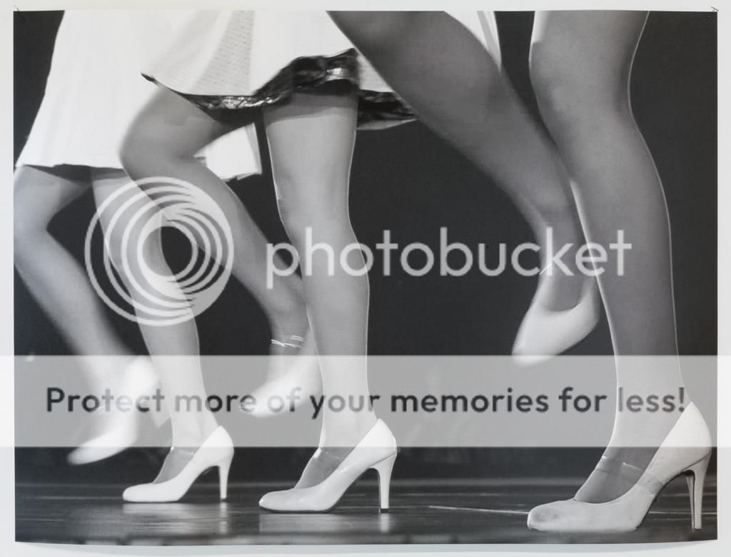
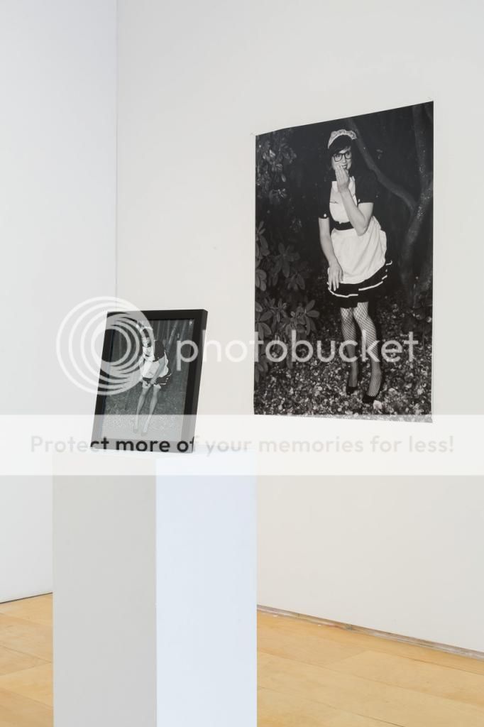
VIA: Can you tell us more about the dancing legs piece?
AS: I was working on a project where I was taking stills of a video with my computer. Print screens and trying to set up compositions. I was obsessed with this modernist figuration that I was finding in a dance video. This photo is a picture of this Japanese dance band named Perfume. They are an electropop band, and they're not very popular in the US. It is not appealing to westerners at all. The dances are robotic, and also if you look at the forms, they're very classical. If you freeze it you really notice this figuration. This is from that series.... It has has different ties into modernist ideals and such. There is repetition. I wouldn't call it a placeholder, but I wanted a space for reflection, but also a reflection to other pieces in the room, The high heels are reiterated in the dancing painting video as well.
 Photograph by Blaine Campbell
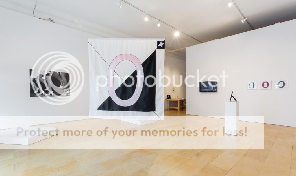
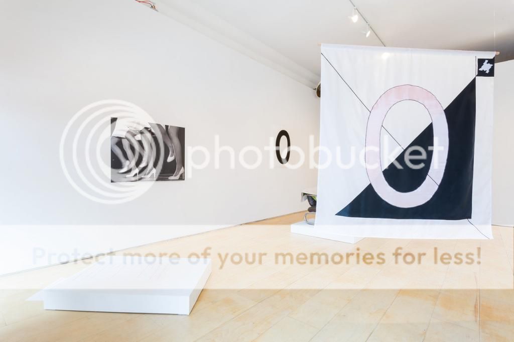
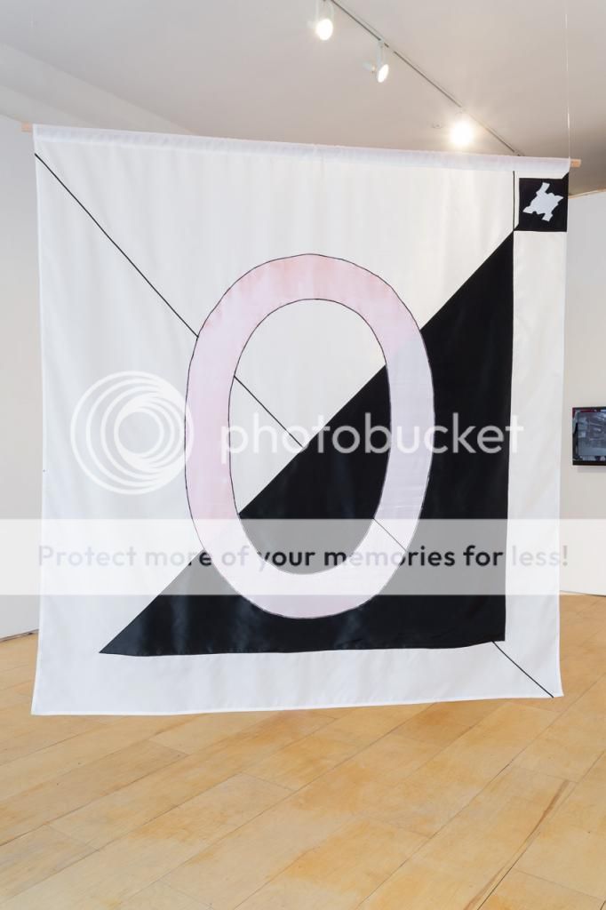
VIA: There is also this very powerful emblematic flag right in the centre of the gallery space. I'm assuming the large zero in the centre of the flag is Comic Sans? There is also a diagonal line running through it. Can you elaborate on your aesthetic and symbolic choices in the creation of the flag?
MC: There are very clear symbolic references in addition to the zero, the geometry the design the lines. There's a suprematism black square, and white square reference. The bisected white and black rectangular flag is also an Anacho Pacifist flag. The top left corner features a houndstooth stitch in isolation. It is a nice abstract monochromatic shape, and it is also this official logo for a department store where I grew up. It is the most recognized corporate symbol in Australia. The company never used a name, just three houndstooth stitches next to each other. Everyone could identify it. And then the diagonal line, that is passing through the centre was an aesthetic choice.
AS: I think the flag is nice because it let's people learn more about our sensibilities, with the Anarcho Pacifist flag, this show is something that is critical, and it allows people into our deeper thinking. We are a shadow collective, it is impossible to hold the collective together. A big part of the show is about putting a commercial space into an artist run centre that is registered with Carfac and everything. We are kind of doing an... I don't know if it would be anarchistic, maybe a pacifist anarchistic gesture by selling work.
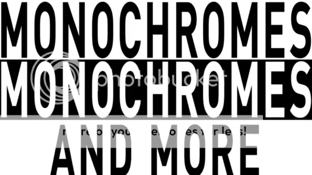
MC: The video Monochromes Monochromes Monochromes advert takes you a little bit out of the tastefulness of the exhibition. But for the neighbourhood, it is more tied into the way that things are advertised around here. There used to be the yelling advertisements that would have been going on at all the tourist shops, there are the laser advertising signs and bright lights to attract clients in. This gallery used to be a grocery store. The space for a long time was about selling goods so, we wanted to advertise the show, and keep in line with things that are going on outside the gallery.
 Photograph by Blaine Campbell


