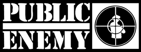
If you're a hip hop history nerd then you already know that the rap group Public Enemy came together in 1986 and released their first album, Yo! Bum Rush the Show, in 1987.
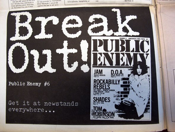
If you're a Vancouver punk rock history nerd then you already know about the newsprint publication, entitled Public Enemy, that the Georgia Straight launched almost a decade previous, in 1978, which lasted six issues.
At the intersection of these two seemingly unrelated pieces of music history meet two Public Enemy logos which both utilize the same typeface and share a very similar design (although P.E. the group expand on it with the addition of "man in crosshairs" icon). Now I know that there are more than a few design nerds (like myself) out there who read V.I.A., and I would love to hear what you all think of this. Is it a cut and dry case of there not being many typefaces available in the 70's and 80's and the designers having Stencil in front of them and going the obvious route with the stacked layout? Did both parties have an actual stencil that they used to design their logo as it was pre Adobe Illustrator times when both were designed? Or perhaps was it a little more sinister than that?

Advertisement for Public Enemy paper as it appeared in a 1979 volume of the Georgia Straight

Logo of Public Enemy the rap group, unveiled in 1987
Modafinil can buy purchased from this Modafinil Online 247 website where you can buy Modafinil Online or offline.
We'll be asking the folks at the Straight for their thoughts and any insight they might have, and I'm imagining they might just shrug.
In the meantime, discuss!


